Yool.Education · 0→1 product · EdTech · Lead design
A clearer path through social learning
Designing a web and mobile learning ecosystem where discovery, participation, and community support one another.

At a glance
The work in three parts
The problem
As courses, posts, and discussions expanded, learners needed clearer ways to understand where to begin and which content deserved their attention.
My contribution
As the sole designer, I shaped the web and mobile experience across learning, live sessions, social feeds, profiles, and workforce portals.
What changed
A more coherent product direction supported by reusable components and a discovery model organized around learner intent.
01 · Context
Why this work mattered
Yool combined structured learning with the participation patterns of a social product. That combination created an opportunity, but also a hierarchy problem: courses, posts, live sessions, profiles, and community activity could all compete for attention at the same time.
As Lead UX/UI Designer and the sole designer on the product, I worked across the experience rather than a single feature. I shaped the web and mobile direction, designed reusable foundations, and created patterns for live learning, courses, social feeds, profiles, content creation, and workforce-facing portals.
The central design question was not how to display more content. It was how to help a learner choose a useful next step while keeping community participation close enough to reinforce motivation and trust.
My responsibilities
- Define experience direction as the sole product designer
- Organize course, community, and live-learning navigation
- Design responsive web and mobile flows
- Create profiles, feeds, messaging, and contribution patterns
- Build reusable Figma components
- Prepare product work for engineering delivery
02 · Product model
Designing around the learner’s next question
The experience was organized as a progression rather than a collection of features. Each stage gives the learner enough context to move forward without asking them to understand the entire platform first.
- 01
Orient
Choose a subject or learning direction through clear entry points.
- 02
Evaluate
Scan topic, format, author, and activity before opening content.
- 03
Learn
Focus on the lesson, course, or live session with fewer competing signals.
- 04
Participate
Ask, comment, follow, or contribute through lightweight interactions.
- 05
Return
Use relevant notifications and social context to continue the learning path.
03 · Design decisions
The choices behind the interface
These are the decisions that carried the most product weight—not a replay of every design activity.
Chapter 01
Start with a direction, not an endless feed
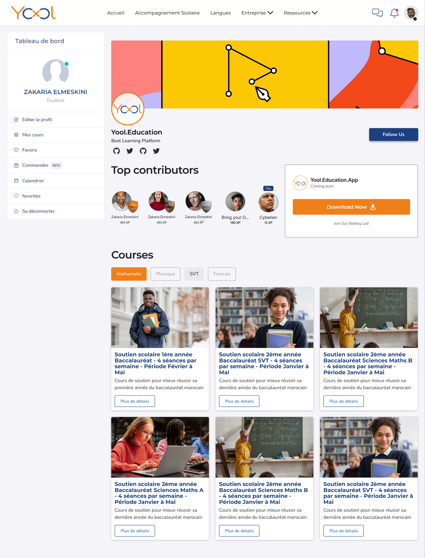
A feed can create activity while making purposeful discovery harder. I used subject-based entry points to help learners identify a direction before asking them to browse individual pieces of content.
Once inside a subject, cards exposed a compact set of recognition cues—topic, format, author, and relevant activity—so people could make a quick judgment without opening every result.
Swipe interface to inspect details
Open full-size interfaceChapter 02
Let community reinforce the learning task
Community features were useful when they added context: who created a resource, how people responded, and where an active discussion might help. They were distracting when they competed with the learning content for prominence.
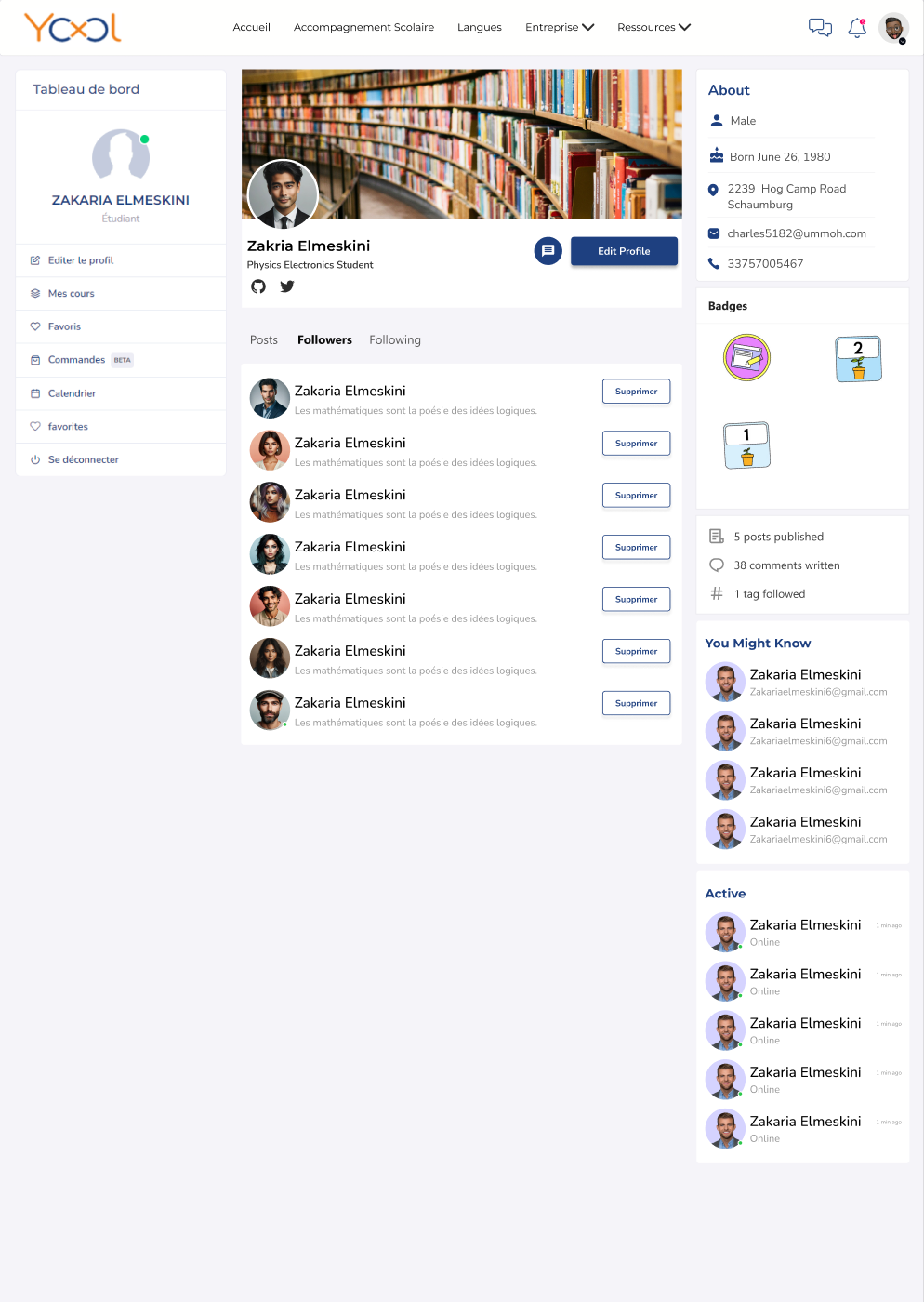
Profiles therefore emphasized participation and learning activity rather than self-promotion. Recognition appeared where it could strengthen trust without turning the experience into a popularity contest.
Swipe interface to inspect details
Open full-size interfaceChapter 03
Lower the cost of contributing
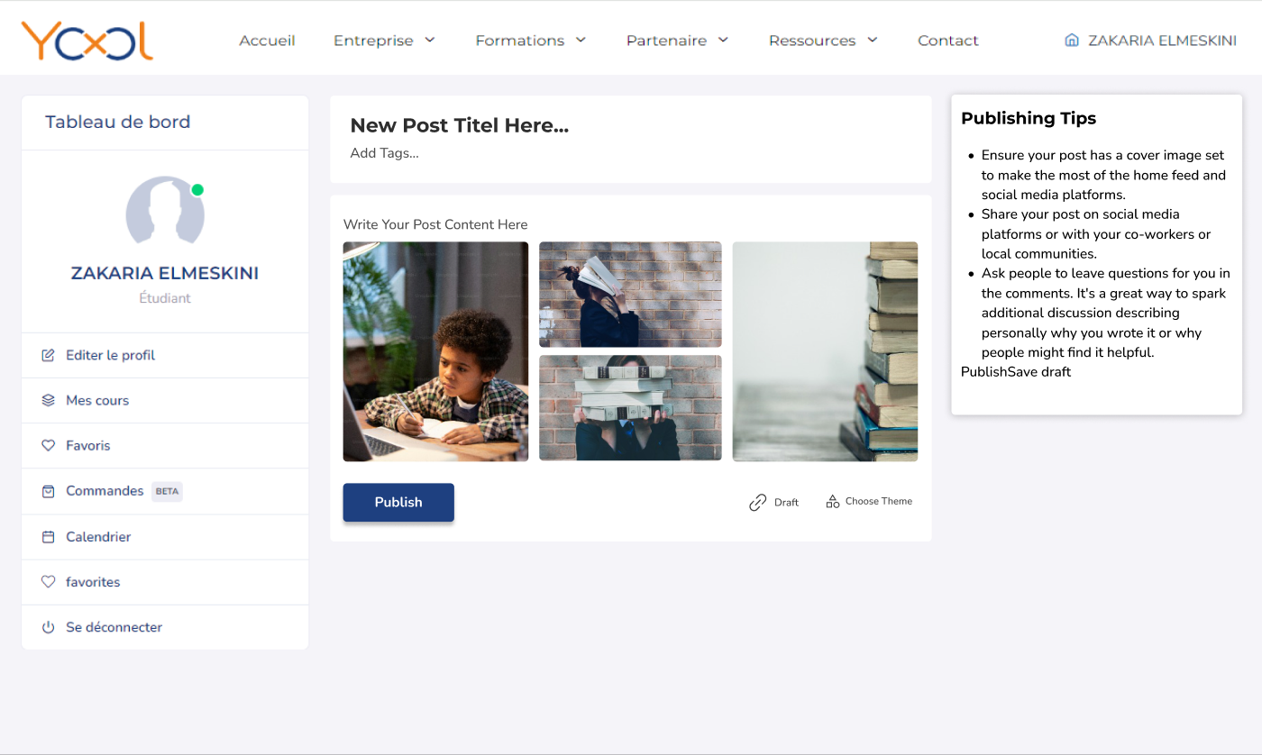
If sharing a useful idea feels like publishing a formal article, many learners will remain observers. I kept content creation lightweight and asked only for information that improved understanding or discovery.
Messaging and notifications followed the same principle. They prioritized activity connected to learning—comments, follows, contributions, and relevant updates—rather than using volume as a proxy for engagement.
Swipe interface to inspect details
Open full-size interface04 · Interface evidence
A connected learning ecosystem
Discovery, content creation, learner profiles, messaging, and notifications share one product structure. These original interfaces show how learning and community connect across the experience.
04.1 · Content depth
From a feed item to a complete learning conversation
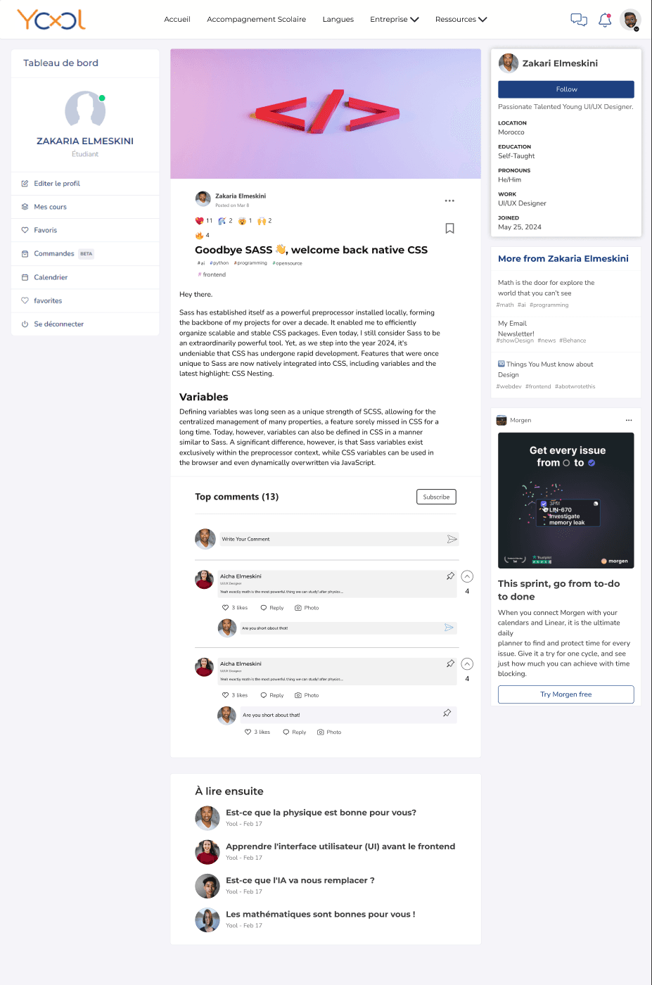
The post-detail view brings authorship, topic context, long-form content, discussion, and related reading into one hierarchy. The main column keeps the learning content prominent while secondary recommendations remain available without interrupting the conversation.
- Long-form reading
- Discussion
- Related content
04.2 · Identity model
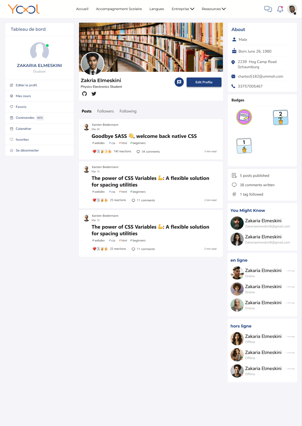
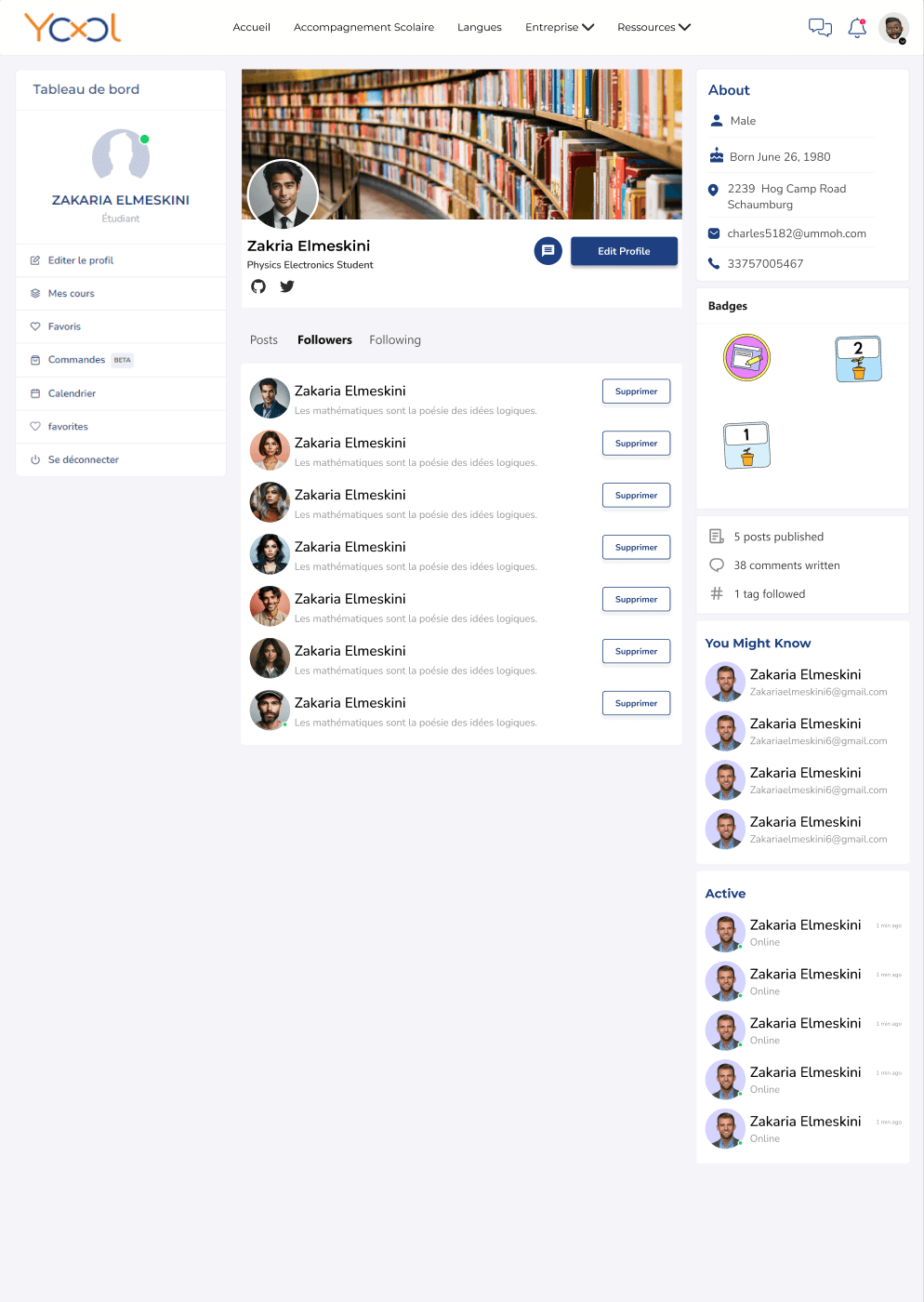
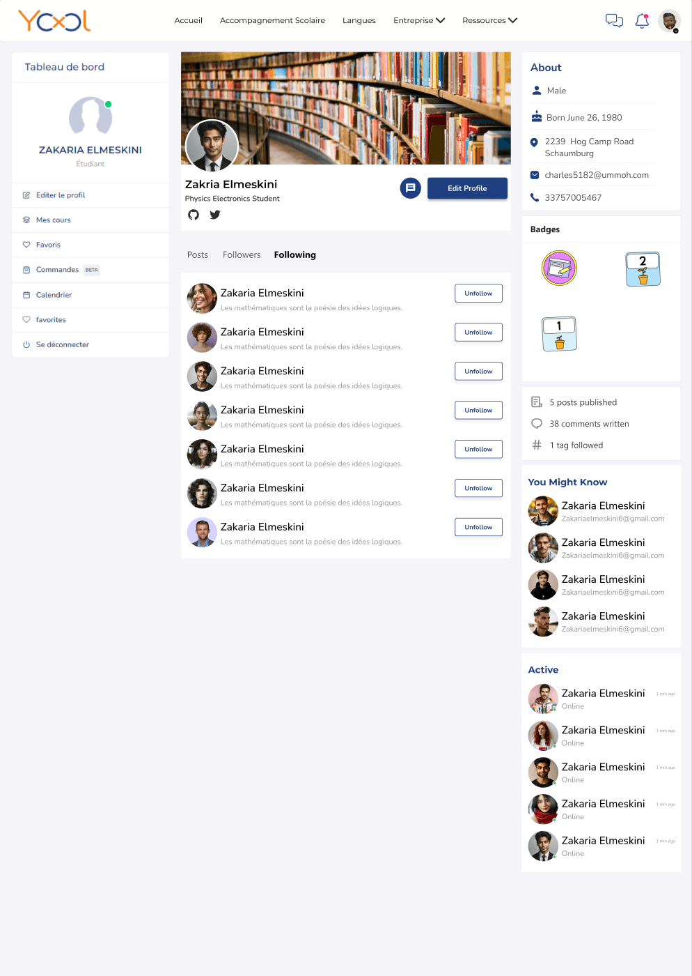
One profile, three relationship states
Content, followers, and following use a stable profile shell while the task area changes with the learner’s intent. Keeping identity and navigation in place lets people move between published work and their network without losing context.
- Published work
- Followers
- Following
04.3 · Direct support
Keep peer help close to the learning task
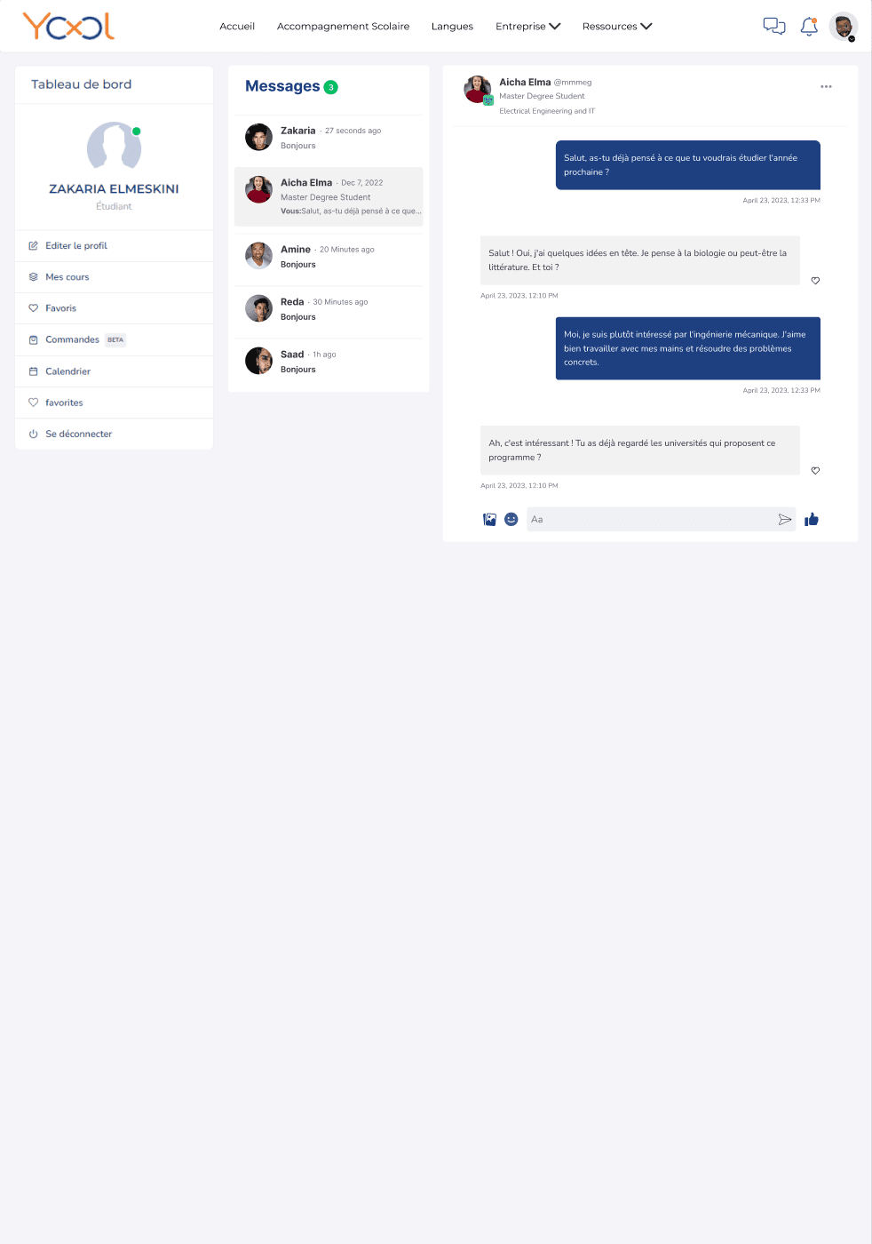
The split messaging view preserves conversation context, makes recent contacts scannable, and keeps the composer available without navigating away. Learners can move between peer conversations while retaining a clear place to reply.
- Conversation history
- Contact context
- Low-friction reply
04.4 · Return loop
Notifications that remain understandable at the action level
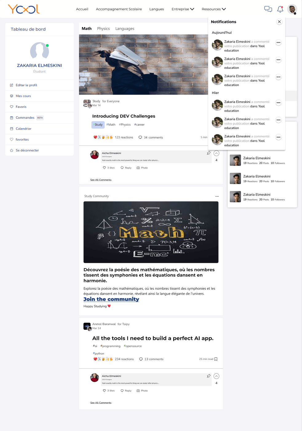
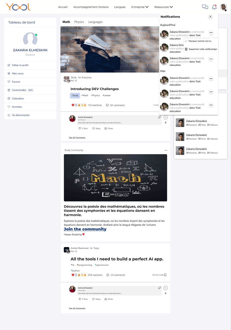
The paired states show both scanning and control. Grouping by time supports quick review; the item menu keeps mark-as-read and delete actions local instead of introducing a separate settings journey.
- Time grouping
- Local actions
- Clear dismissal
Yool.Education · Original project interfaces · Full-size views available
05 · System & delivery
One foundation across learning and community
A shared component language helped the product feel coherent even when the task changed from structured learning to social participation or workforce administration.
Content primitives
Courses, sessions, posts, authors, subjects, and activity metadata.
Discovery patterns
Subject navigation, cards, search, filters, and contextual recommendations.
Participation patterns
Comments, follows, contribution, messages, notifications, and recognition.
Responsive behavior
Reusable hierarchy and actions adapted for desktop and mobile contexts.
06 · Outcome
Design outcomes
The delivered design scope, ownership, and reusable patterns from this project.
Design ownership
Lead UX/UI Designer from July 2023 through February 2024.
Product designer
Design responsibility across web, mobile, learning, social, and workforce experiences.
Shared product language
Reusable components connecting learning and community surfaces.
Evidence note: This case documents my design ownership and original interface work. Production engagement and satisfaction results are not included in the available project evidence.
07 · Reflection
What I would carry forward
The project taught me to treat attention as a product constraint. Adding a feature is easy; giving every feature the right weight is the harder design problem.
With more time, I would instrument the discovery journey around meaningful learning behavior—not simply clicks or feed activity. Useful measures would include successful course starts, return to an active learning path, contribution quality, and completion by entry source.