Globant · Off-road exploration · Gamification · Web + mobile
Off Road Treasure Quest
Connecting trail discovery, quest membership, maps, competitive progress, and community—designed with an international team at Globant.
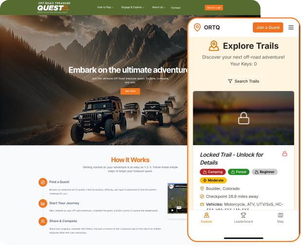
At a glance
The work in three parts
The problem
Off-road explorers needed to evaluate trails, understand a keys-and-rewards model before joining, and stay oriented across discovery, maps, progress, and community.
My contribution
I contributed UX/UI design to Off Road Treasure Quest at Globant, collaborating with an international project team across the U.K., U.S., and EU.
The design shown
The interface connects desktop trail browsing and quest selection with mobile exploration, map context, leaderboard progress, and groups.
01 · Context
Why this work mattered
Off Road Treasure Quest was a project I worked on as a UX/UI Designer while employed at Globant. I collaborated with an international team based across the United Kingdom, United States, and European Union. This case study covers that project only, and presents my contribution within a shared team effort—not as a solo product build.
The product combines off-road exploration with a quest model. People can browse trails, join a timed challenge, unlock protected trail information with keys, use map context, compare progress, and connect with groups. The challenge is making these concepts understandable as one experience rather than as separate features.
Desktop discovery needs to reveal enough information for someone to judge whether a trail fits their location, vehicle, and experience level. Joining a quest introduces a different decision: what access costs, what keys unlock, and how participation connects to rewards. Mobile then needs to keep trail discovery, location, and progress easy to reach.
The screens below document those connected product surfaces. They support a discussion of interface structure and interaction trade-offs; they do not establish research findings or a measured business result.
My responsibilities
- Contribute UX/UI design to the Off Road Treasure Quest project
- Work on the product’s web and mobile interface experience
- Collaborate with project teammates across the U.K., U.S., and EU
02 · Product model
The engagement loop
Each stage answers a different user question while preserving one continuous model of trails, keys, progress, and rewards.
- 01
Discover
Filter the trail catalog and evaluate terrain, difficulty, distance, and vehicle context.
- 02
Join
Review the quest period, included keys, price, and qualification model before payment.
- 03
Explore
Move between trail information and map context through a compact mobile navigation model.
- 04
Progress
Track leaderboard position and use groups to connect competition with community.
03 · Design decisions
The choices behind the interface
These are the decisions that carried the most product weight—not a replay of every design activity.
Decision 01 · Discovery
Let people evaluate a trail before asking them to unlock it
The desktop catalog exposes six search dimensions: state, city, distance, difficulty, experience, and trail status. Each result adds terrain, vehicle compatibility, checkpoint distance, and seasonal context. Protected details remain visibly locked, but the entire result is not hidden.
This is the main trade-off in discovery: preserve the access model without removing the information people need to assess relevance. Keeping practical trail attributes visible gives someone a reason to continue; the lock and Join a Quest action make the access boundary explicit.
- Six filter dimensions
- Visible trail attributes
- Locked-detail state
- Clear next action
Decision 02 · Commitment
Explain what membership unlocks before payment
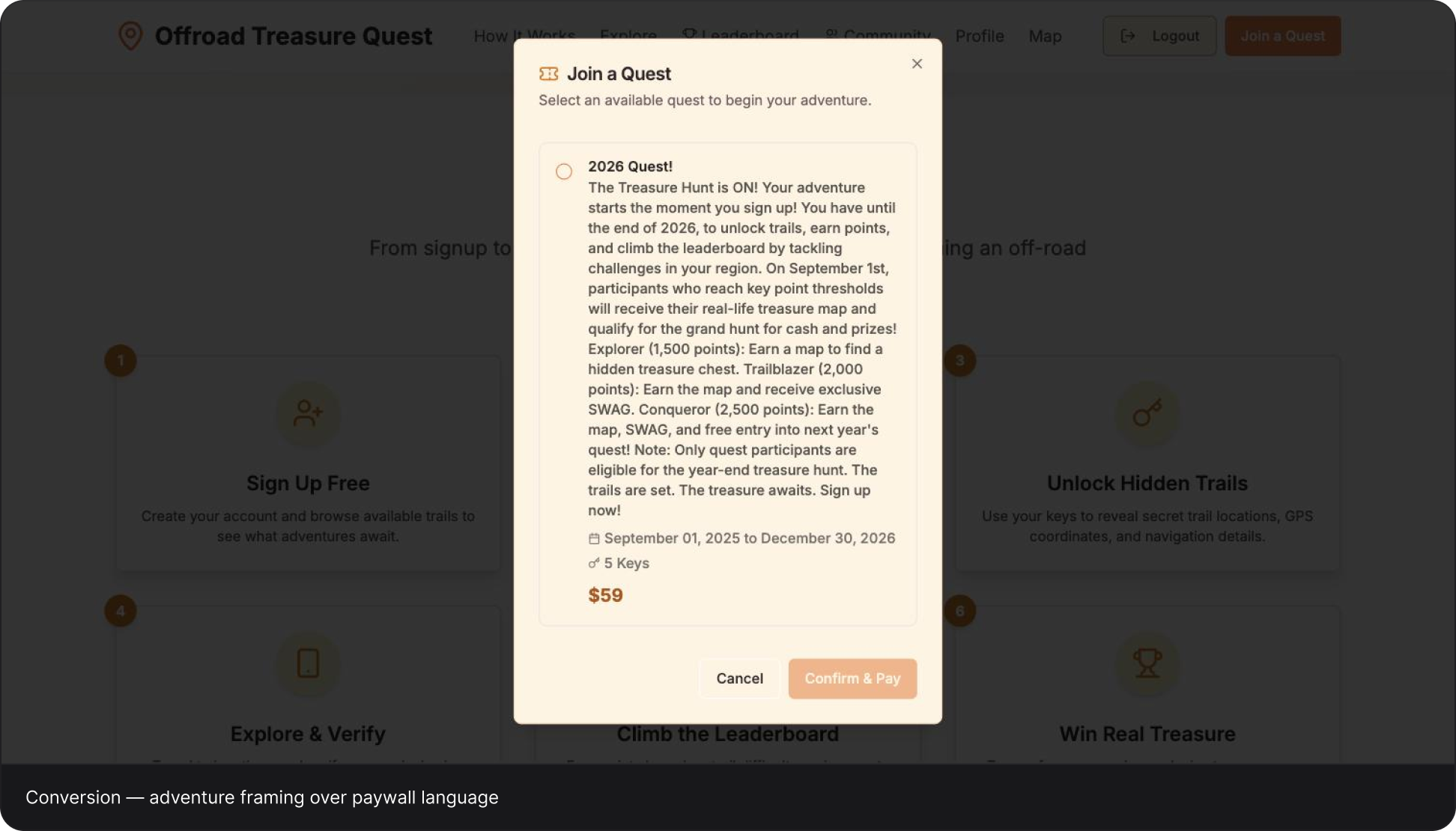
The Join a Quest state brings the active period, five included keys, price, and reward thresholds into one selection step. Payment is framed as entry into a defined challenge rather than as an unexplained fee for opening a trail card.
The trade-off is completeness versus readability. The information is present, but the long description makes comparison and scanning harder than necessary. My next iteration would separate timing, included access, and reward tiers, with the price kept close to the confirmation action. That is an improvement opportunity, not a claim that the current version has already increased conversion.
- Value before payment
- Visible price
- Eligibility context
- Hierarchy to improve
Decision 03 · Mobile loop
Keep exploration, place, progress, and community connected
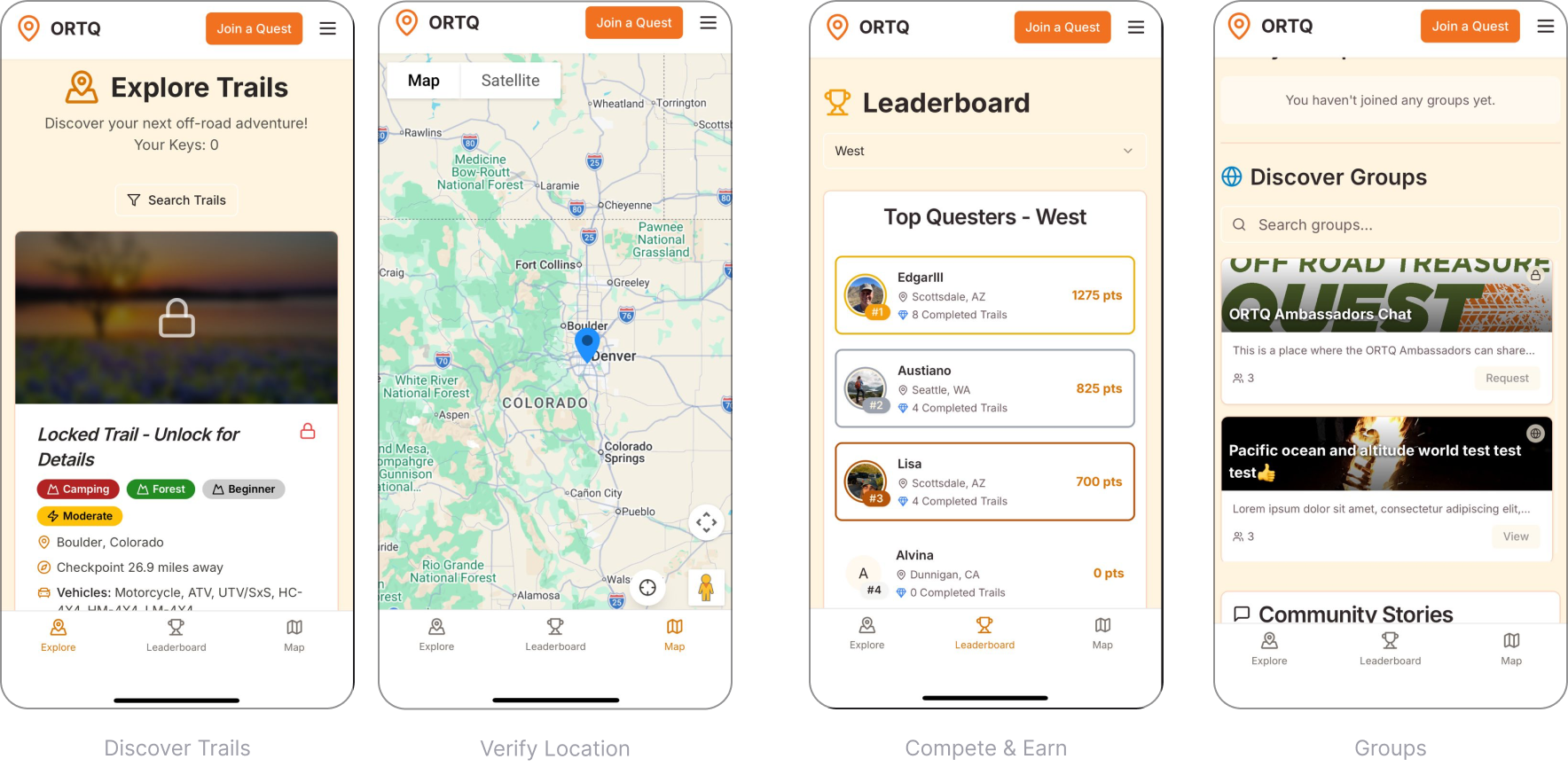
The mobile interfaces keep Explore, Leaderboard, and Map in a stable bottom navigation. Each view gives the current task most of the screen: browsing a trail, looking at the map, or reviewing regional standings. Join a Quest stays visible in the header without replacing the core navigation.
Groups add a social layer alongside individual progress. These views show how discovery, spatial context, competition, and community coexist within the same product. The map screen demonstrates location context; it does not, by itself, prove a completed GPS check-in or successful field verification.
- Stable navigation
- Map context
- Progress visibility
- Community layer
04 · Interface evidence
One loop across discovery, membership, and field use
Off Road Treasure Quest brings trail evaluation, quest access, map context, rankings, and groups into one product. These web and mobile interfaces show the work from that Globant engagement.
04.1 · Discovery and gating
Expose enough value before the lock
The trail catalog lets people evaluate location, distance, difficulty, experience, terrain, vehicle fit, checkpoint distance, and season before revealing protected details. The lock communicates the membership boundary without making the inventory meaningless to a non-member.
The sign-in screen keeps account entry separate from trail evaluation, with a focused form and familiar outdoor imagery.
- Structured filtering
- Trail attributes
- Locked details
- Account entry
04.2 · Membership decision
Make the commitment understandable before payment
The Join a Quest state consolidates the active period, included keys, price, and qualification model before the payment action. That transparency makes the transaction part of the product logic rather than an unexplained paywall.
Design critique: the information is complete, but the paragraph is too dense. A stronger next iteration would separate timing, access, and reward tiers into a scannable hierarchy while keeping price and confirmation together.
- Quest period
- Five-key allocation
- Visible price
- Reward thresholds
Swipe interface to inspect details
04.3 · Mobile product loop
Keep place, progress, and community within reach
A stable bottom navigation anchors the experience around Explore, Leaderboard, and Map while each screen gives the active task most of the space. The persistent Join a Quest action keeps conversion available without replacing exploration.
The group surface expands the loop beyond individual trail completion. Together, the screens connect discovery, spatial orientation, competitive progress, and community in one mobile system.
- Explore
- Map context
- Leaderboard
- Groups
Swipe interface to inspect details
Off Road Treasure Quest · Original project UI · Globant engagement with an international U.K., U.S., and EU team
05 · System & delivery
One vocabulary across web and mobile
Trails, locks, keys, regions, rankings, and groups remain recognizable across devices. The visible UI uses recurring patterns to connect the quest model without giving every screen the same layout.
Trail evaluation
Repeated badges and attributes distinguish terrain, difficulty, experience, distance, and vehicle fit.
Access states
Locks, keys, quest selection, and price make the access model visible across discovery and commitment.
Mobile wayfinding
Explore, Leaderboard, and Map provide stable anchors while the content changes by task.
Progress & community
Regional rankings and group cards connect individual activity with a wider participant network.
06 · Outcome
What this case documents
The documented scope is a connected web and mobile experience, developed with an international team at Globant.
Connected platforms
Desktop discovery and quest selection connect with mobile exploration, maps, rankings, and groups.
International project team
I contributed as a UX/UI Designer within the Globant project team across the U.K., U.S., and EU.
Shared quest model
Trails, keys, membership, rewards, and community are represented across the documented interfaces.
Evidence note: This case study covers only the Off Road Treasure Quest engagement at Globant. The screens document the interface design; research methods, release details, and performance results are not claimed here.
07 · Reflection
What I would carry forward
The strength of this project is the connected product model. Trail attributes support evaluation; locks and keys explain access; maps provide spatial context; and rankings and groups give people reasons to return. The important design question is how clearly those concepts connect, not how many features fit on a screen.
The next iteration should make the membership decision more scannable and validate the mobile experience in real field conditions. Sunlight, movement, connectivity, and location permissions cannot be judged reliably from static interfaces. Those checks would be necessary before claiming that the field experience is dependable.