Independent 0→1 project · Consumer travel · Product strategy · Mobile commerce
Travel booking, without the second-guessing
Creating an end-to-end mobile travel product from zero—across discovery, flights, stays, checkout, and confirmation.
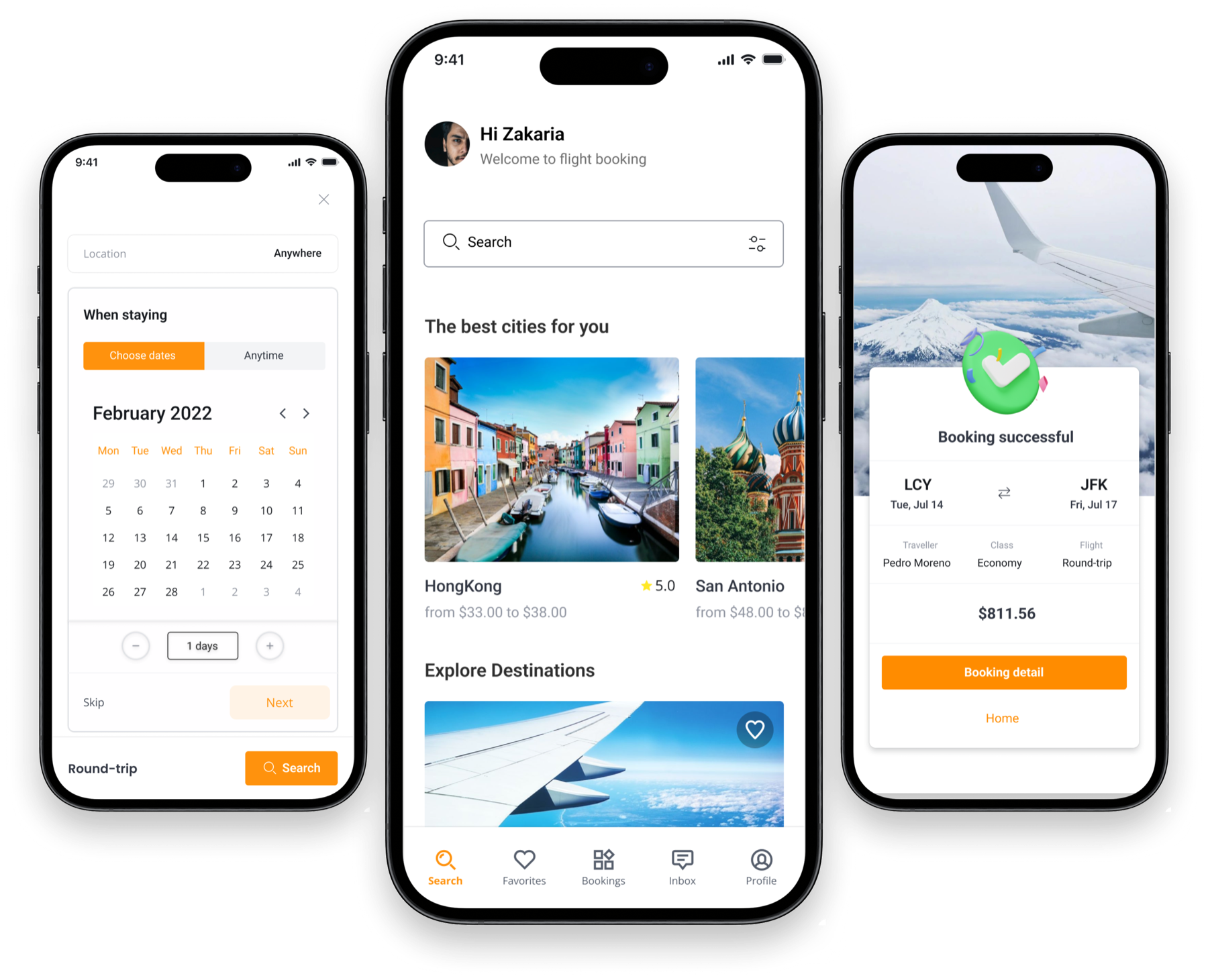
At a glance
The work in three parts
The problem
The design challenge was to help travelers evaluate price, timing, flexibility, and trip logistics without hiding information that could change the booking decision.
My contribution
Starting from a blank canvas, I defined the product structure, mapped the end-to-end journeys, and designed a reusable mobile interface system for flights and stays.
What changed
A 37-screen product system covering the complete path from account access and discovery through booking and confirmation.
01 · Context
Why this work mattered
Booking a trip is not a single choice. A low fare can carry restrictive conditions; a convenient flight can create a difficult transfer; and details that feel secondary during search can become decisive at checkout. The interface needed to help people compare those tradeoffs without turning every card into a wall of information.
I created this project independently from zero. Rather than redesigning an existing service, I defined the journey, information architecture, interaction patterns, and visual system from a blank canvas.
The resulting mobile product connects account access, discovery, search setup, results, detail, filters, traveler information, optional services, payment, and confirmation across flight and accommodation journeys.
The product grew into a 37-frame system covering the primary journeys, validation states, and meaningful search variations. I treated that breadth as one connected product model rather than a collection of isolated screens.
Because there was no inherited design system, I established the reusable patterns alongside the product itself. Shared inputs, result cards, checkout structures, and feedback states keep the experience coherent while allowing each travel service to present the information its customers actually need.
My responsibilities
- Frame the product problem and booking model
- Map the end-to-end information architecture
- Design flight and accommodation journeys
- Prototype the complete mobile booking flow
- Create reusable interface components and patterns
- Design validation, recovery, and confirmation states
02 · Product model
One decision model across flights and stays
The content changes by service, but the underlying journey stays coherent: establish intent, compare options, inspect the details that change value, commit with a visible total, and recover clearly when something goes wrong.
- 01
Discover
Move from inspiration or a known destination into a structured search.
- 02
Configure
Set location, dates, guests, cabin, and trip type through focused steps.
- 03
Compare
Scan the attributes that repeatedly change a booking decision.
- 04
Commit
Add required information and optional services with the total kept in view.
- 05
Confirm
Close the journey with a clear itinerary, traveler, class, and final price.
03 · Design decisions
The choices behind the interface
These are the decisions that carried the most product weight—not a replay of every design activity.
Decision 01
Break a complex search into focused decisions
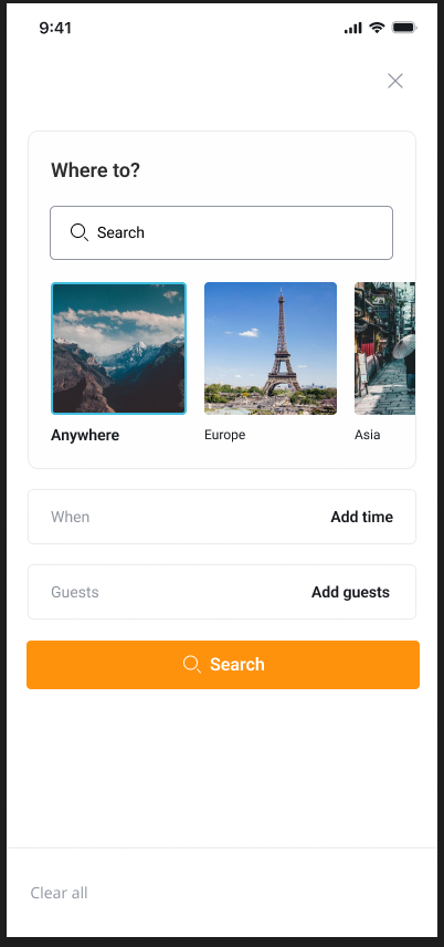
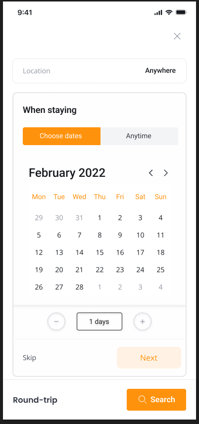
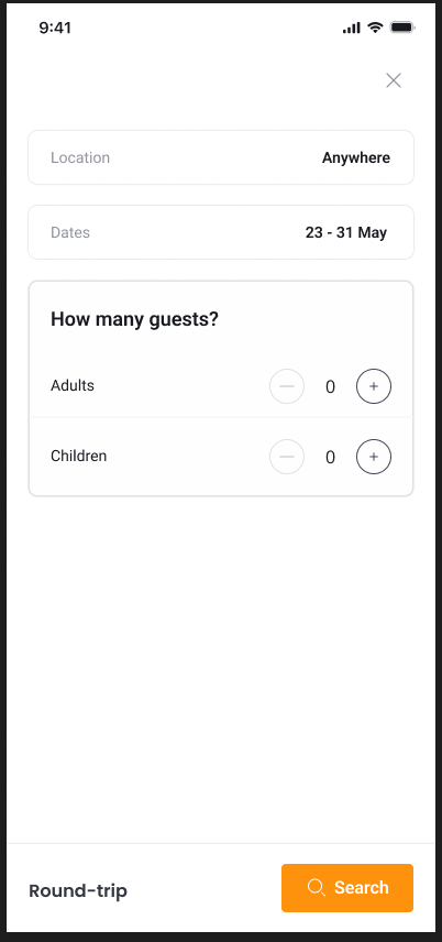
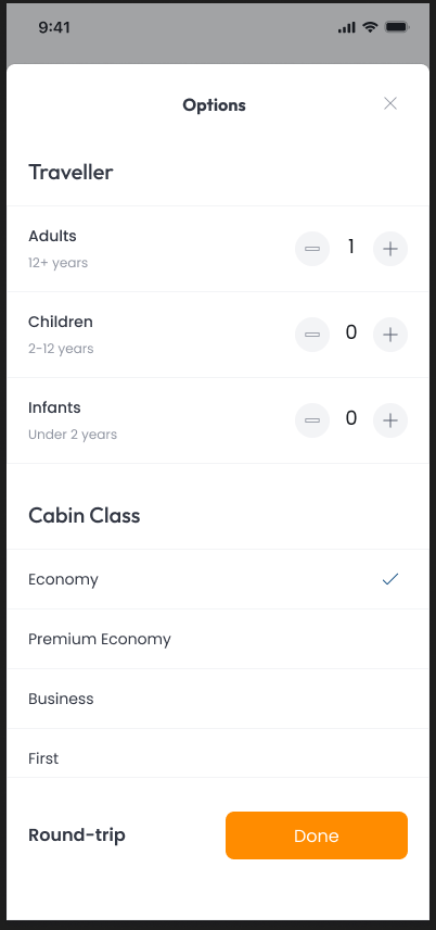
Location, dates, party size, cabin, and trip type create a demanding mobile form when they compete on one screen. I separated those decisions into focused steps while preserving the developing query across the flow.
This makes each choice easier to understand and gives contextual controls—such as regional suggestions, a calendar, counters, and cabin options—the space they need without turning the search entry into an administrative task.
- Focused steps
- Visible query state
- Contextual controls
- Lower input load
Decision 02
Keep comparison scannable, then reveal the depth
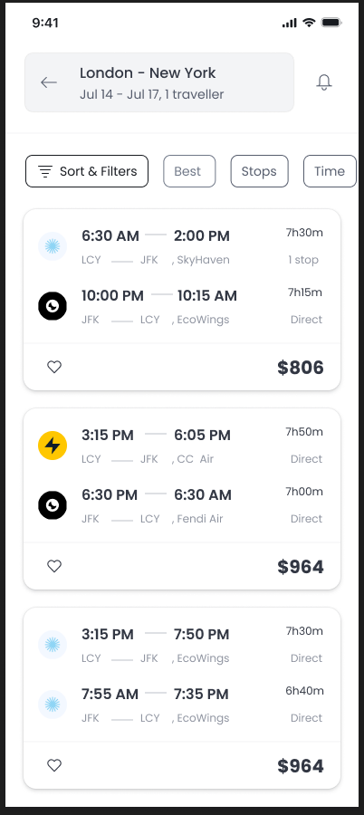
Flight results align the attributes customers repeatedly compare: departure, arrival, duration, stops, airline, and price. The stable card hierarchy makes differences visible without asking people to decode a new pattern for every option.
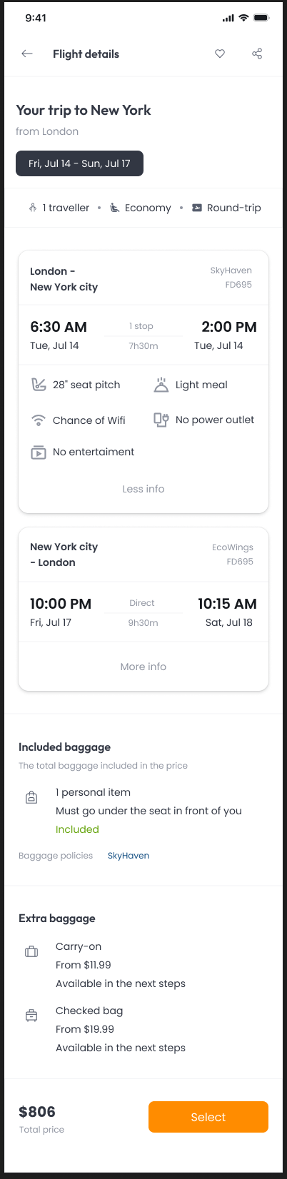
The detail view carries the secondary information—segment amenities, baggage allowance, additional baggage, and provider policies. Progressive disclosure protects scanning speed while keeping the information needed for a confident decision close to the selection.
- Aligned attributes
- Stable result cards
- Progressive disclosure
- Baggage clarity
Decision 03
Keep progress and cost visible through checkout
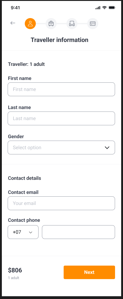
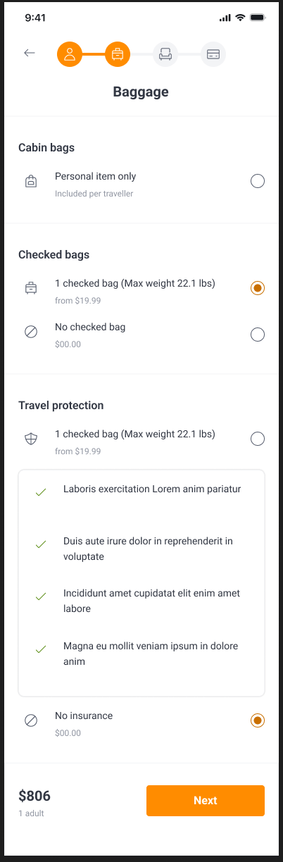
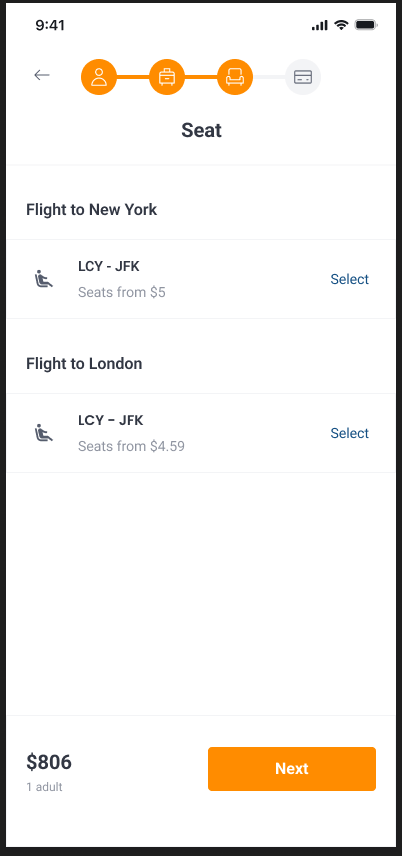
The checkout sequence separates traveler information, baggage and protection, seats, and payment into understandable commitments. A persistent progress indicator shows where the traveler is, while the price summary keeps the financial consequence of each choice visible.
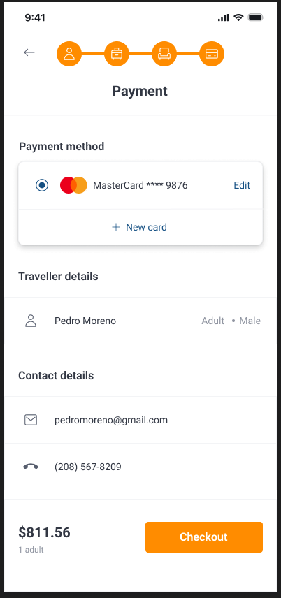
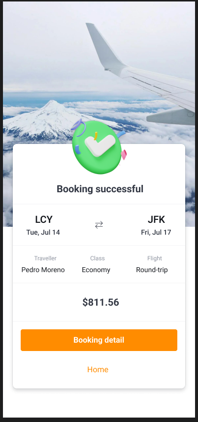
The final payment screen consolidates method, traveler, contact details, and total before checkout. Confirmation then closes the loop with the route, dates, traveler, class, and final amount—turning a high-anxiety action into a clear record.
- Visible progress
- Persistent total
- Optional services
- Explicit confirmation
04 · Interface evidence
The complete path to a confident booking
I designed 37 mobile frames across account access, discovery, flights, stays, checkout, and validation. This presentation focuses on the 20 screens that best explain the product model and the decisions behind it.
04.1 · Trip setup
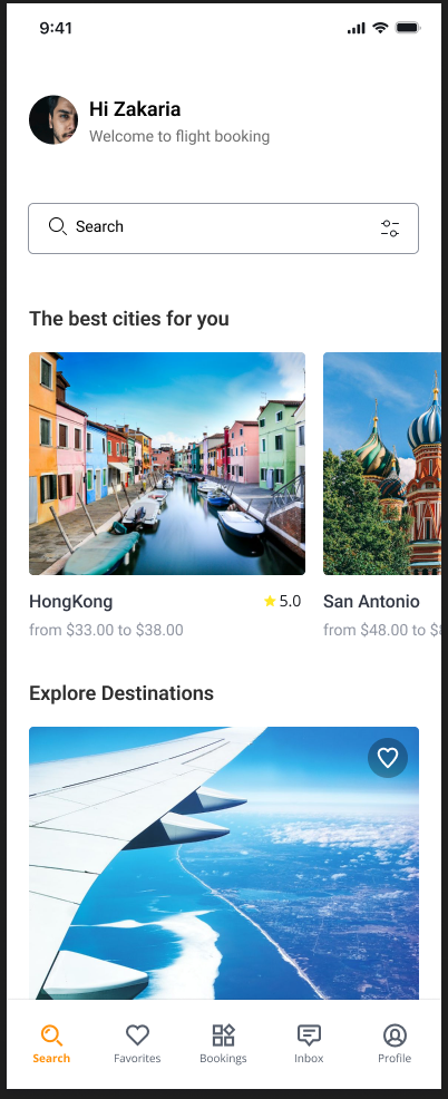
Turn an open-ended idea into a usable search
The discovery home balances inspiration with a direct route into search. Instead of presenting one dense form, the flow separates location, dates, party size, and flight-specific options into focused steps that preserve the traveler’s developing query.
- Destination intent
- Dates
- Guests
- Cabin context
04.2 · Flight evaluation
Keep the comparison simple, then reveal the depth
Results align departure, arrival, duration, stops, airline, and price in a stable card structure. The detail view then expands the selected itinerary with amenities and baggage rules, keeping dense information available without forcing it into every result.
- Schedule
- Stops
- Price
- Baggage
04.3 · Flight checkout
Make progress and cost visible through every commitment
A persistent step indicator and price summary connect the checkout sequence. Optional products appear where they can be understood, while the payment screen consolidates traveler, contact, method, and total before the final action.
- Traveller
- Baggage
- Seat
- Payment
- Confirmation
04.4 · Stays
Reuse the decision model without flattening the product
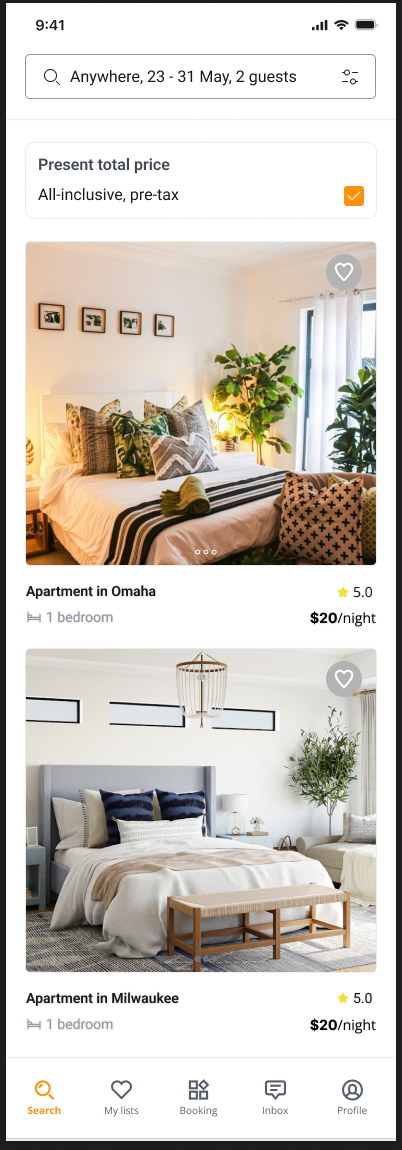
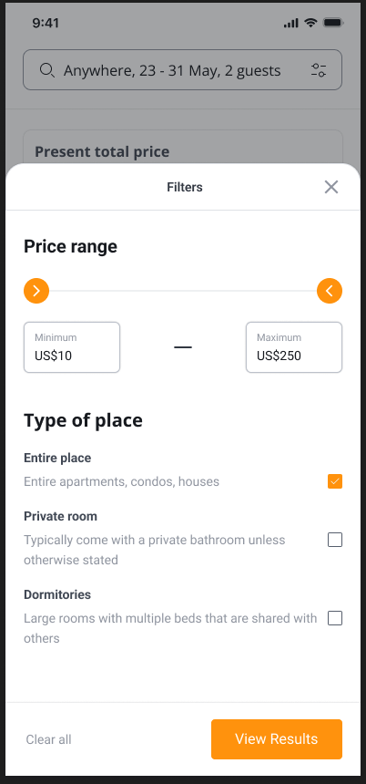
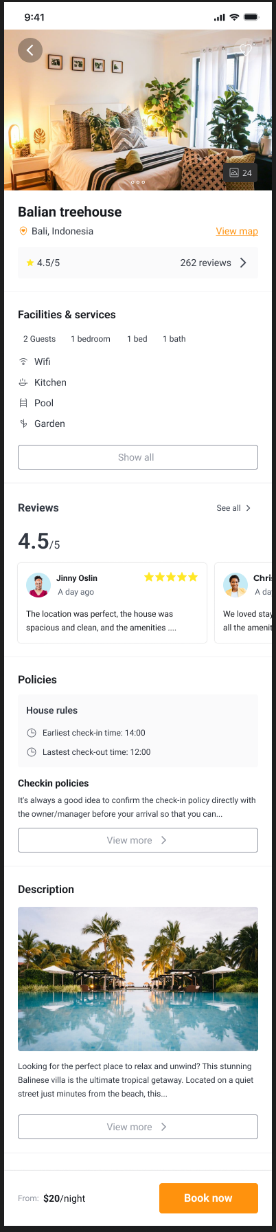
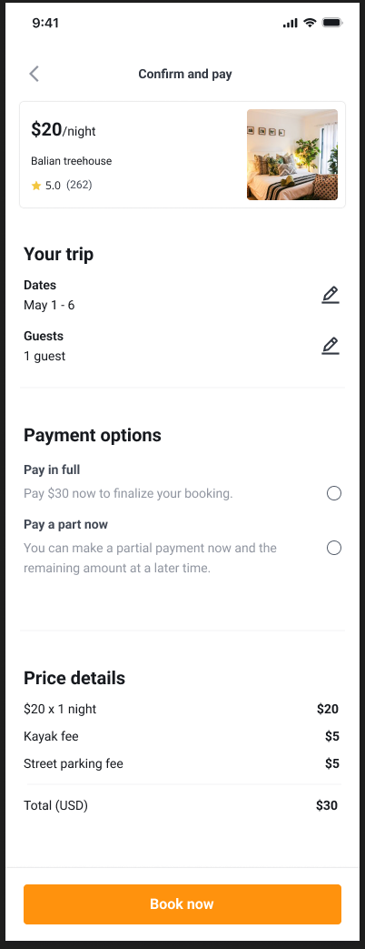
The accommodation path uses the same underlying progression—search, compare, understand, commit—but adapts the content model for imagery, facilities, reviews, policies, and partial-payment options. Consistency comes from the journey logic, not from making flights and stays look identical.
- Total price
- Filters
- Trust signals
- Payment choice
04.5 · State completeness
Design the recovery moments, not only the happy path
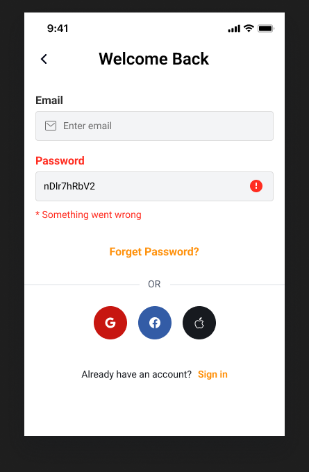
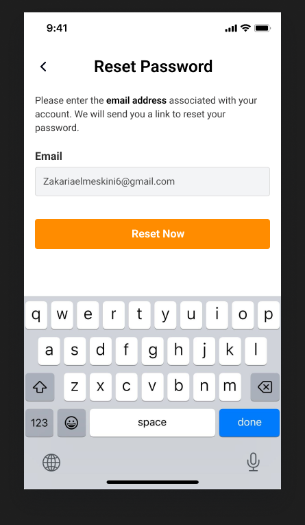
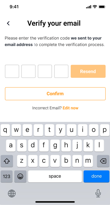
The account work documents the states that make a transaction feel recoverable: a clear starting point, an inline sign-in error, a direct password-reset path, and a separate identity-verification step.
- Entry
- Inline error
- Recovery
- Verification

Independent 0→1 product · Original UI created in Figma · 20 representative screens selected from a 37-frame system · Full-size views available
05 · System & delivery
Components built around decisions
The reusable logic is visible across 37 frames: consistent input behavior, comparable result objects, a stable checkout scaffold, and explicit feedback for errors and completion.
Search inputs
Dates, travelers, locations, and service-specific parameters with clear validation.
Result cards
A consistent comparison hierarchy with room for fare, timing, flexibility, and provider details.
Checkout scaffold
Progress, traveler information, optional products, review, payment, and confirmation.
State feedback
Inline errors, password requirements, completion feedback, and clear recovery paths.
06 · Outcome
Design outcomes
The delivered design scope, ownership, and reusable patterns from this project.
Product created from zero
Independent ownership from product framing and journey architecture through the complete mobile interface system.
Product screens designed
A connected mobile system spanning account access, discovery, flights, stays, checkout, and confirmation.
Booking domains shown
End-to-end flight and accommodation journeys supported by original UI.
Evidence note: The 37-screen Figma system and the UI shown here are original work from this independently created product. The outcomes describe the design scope; no production performance metric is presented.
07 · Reflection
What I would carry forward
This work reinforced that clarity in commerce is not achieved by removing information. It comes from presenting the right information at the moment when it changes a decision.
A future iteration would validate the product with travelers across discovery, comparison, and checkout, then use clearly defined funnel events to connect usability findings with measurable behavior. This independently created project documents the design system and journeys, not production performance.