Alter Learning · Design systems · Accessibility · Responsive UI
Accessible foundations for learning
Establishing reusable interface foundations for a global learning product across screen sizes.
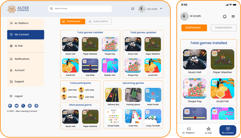
At a glance
The work in three parts
The problem
The learning interface needed foundations that could remain readable, consistent, and responsive for a broad learner population.
My contribution
I worked on spacing, typography, responsive buttons, and accessible color foundations with a distributed team.
What changed
A reusable visual and interaction foundation for responsive product work.
01 · Context
Why this work mattered
This early professional engagement focused on the details that make a product system dependable: spacing, type, color, controls, and responsive behavior.
As a UX/UI design intern, I contributed interface foundations alongside a distributed team. The work shaped how I approach reusable patterns and responsive behavior in later projects.
My responsibilities
- Define spacing and typography scales
- Design responsive button variants
- Support accessible color choices
- Collaborate with a global team
02 · Product model
Foundation before expansion
Repeated interface choices were turned into shared rules that could travel across screens.
- 01
Audit
Identify inconsistent visual and responsive behavior.
- 02
Define
Create reusable scales and role-based color decisions.
- 03
Apply
Use shared controls across desktop and mobile layouts.
- 04
Review
Check readability and behavior with the wider team.
03 · Design decisions
The choices behind the interface
These are the decisions that carried the most product weight—not a replay of every design activity.
Focus
Make the default choice the consistent choice
Spacing, typography, color, and button behavior were structured as reusable foundations rather than solved independently on every screen.
- Spacing scale
- Type hierarchy
- Accessible colors
- Responsive variants
04 · System & delivery
Responsive foundations
The contribution centered on repeatable interface rules.
Spacing
A shared rhythm for layout and component composition.
Typography
Readable hierarchy across screen sizes.
Controls
Button variants and responsive behavior.
Color
Higher-contrast choices for diverse learners.
05 · Outcome
Design outcomes
The delivered design scope, ownership, and reusable patterns from this project.
Professional engagement
UX/UI design internship from February through July 2022.
Cross-screen foundation
Shared behavior for desktop and mobile use.
Design priority
Contrast and readability informed the visual foundation.
Evidence note: The work shown reflects my internship contribution to interface foundations, not ownership of the broader product. No production performance result is presented.
06 · Reflection
What I would carry forward
This project taught me that systems work begins with careful defaults. A small, well-defined foundation can prevent hundreds of inconsistent decisions later.