Yool Education
Improving Content Discovery in a Learning Platform
Project Overview
Yool is a social learning platform that mixes educational content with community interaction. My role was to make the platform feel easier to explore, strengthen recognition signals, and encourage meaningful participation without overwhelming users.
The Situation
As the platform gained global access to more courses, posts, and discussions—but navigating that content became overwhelming. Users often struggled to know where to start or how to engage.
What Needed to Change
Users arrived with clear learning paths and motivations but hit friction quickly. Poor visual hierarchy, limited context, and confusing navigation made it hard to decide what to do next or discover relevant content.
Design Approach
Rather than adding more features, I simplified the interface: reducing visual noise, making navigation choices, and interaction was reduced from over 40 pathways to a streamlined "done-but-help-user-decide-what-to-do-next" UI.
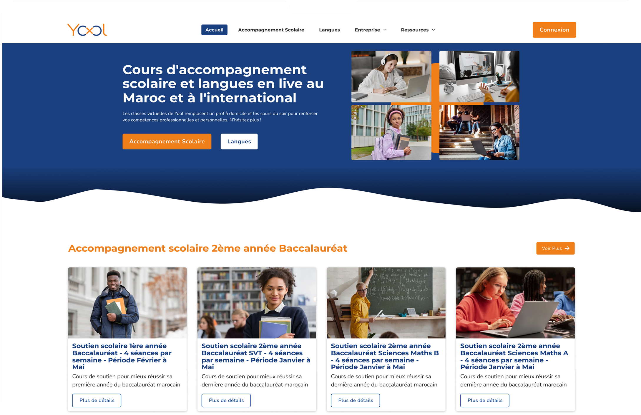
ENTRY & DISCOVERY
The experience opens with subject-based entry points that help users quickly select themselves. Organizing content around learning themes allows users to choose a direction without scanning the entire platform.
BROWSING CONTENT
Designed for fast scanning and confident selection
The content browsing experience is optimized for comparison rather than exploration. Every card surfaces just enough context—format, topic, author, and key stats—to help users evaluate without deep-diving. This approach lets users trust their quick judgments while avoiding the paradox of choice that makes discovery overwhelming.
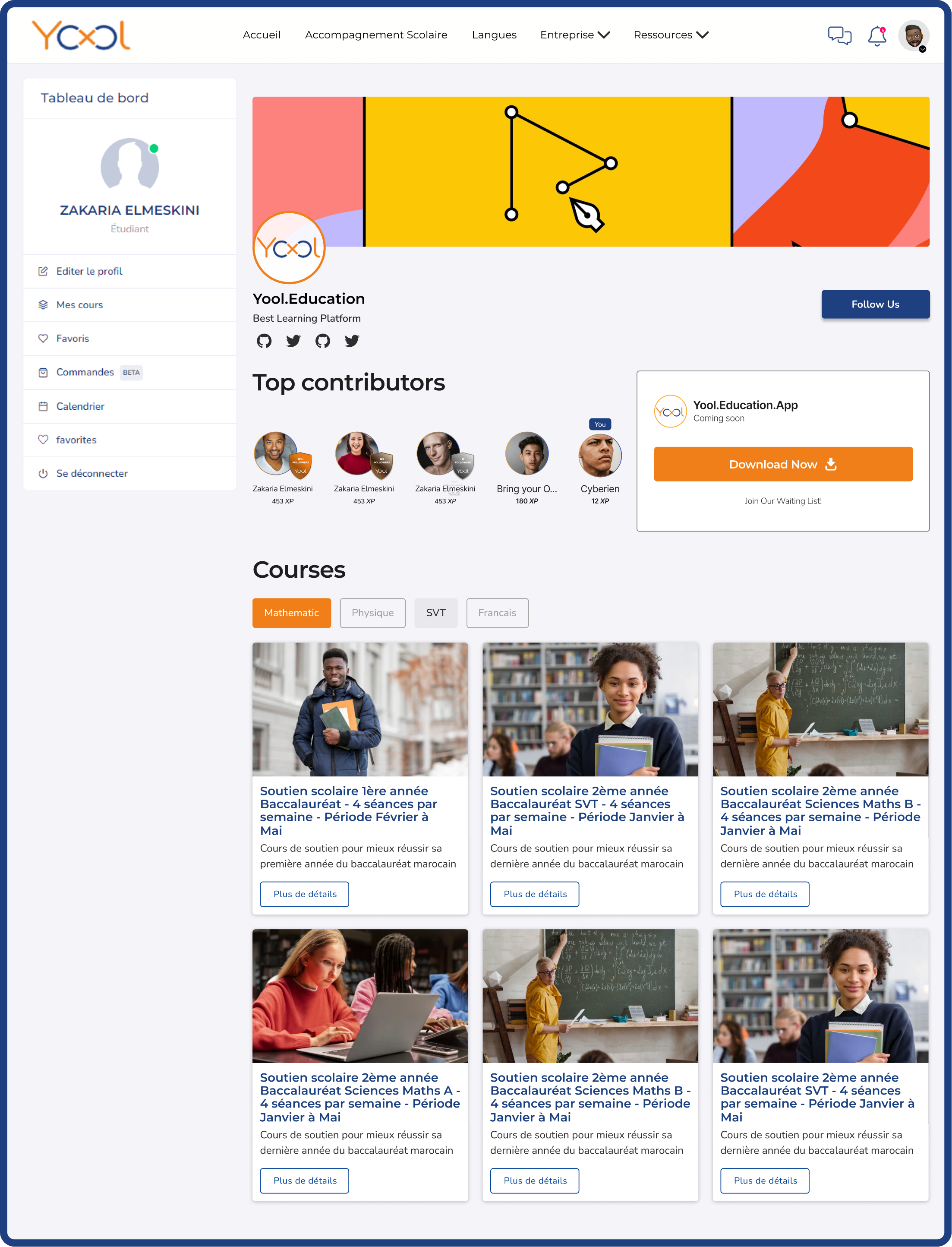
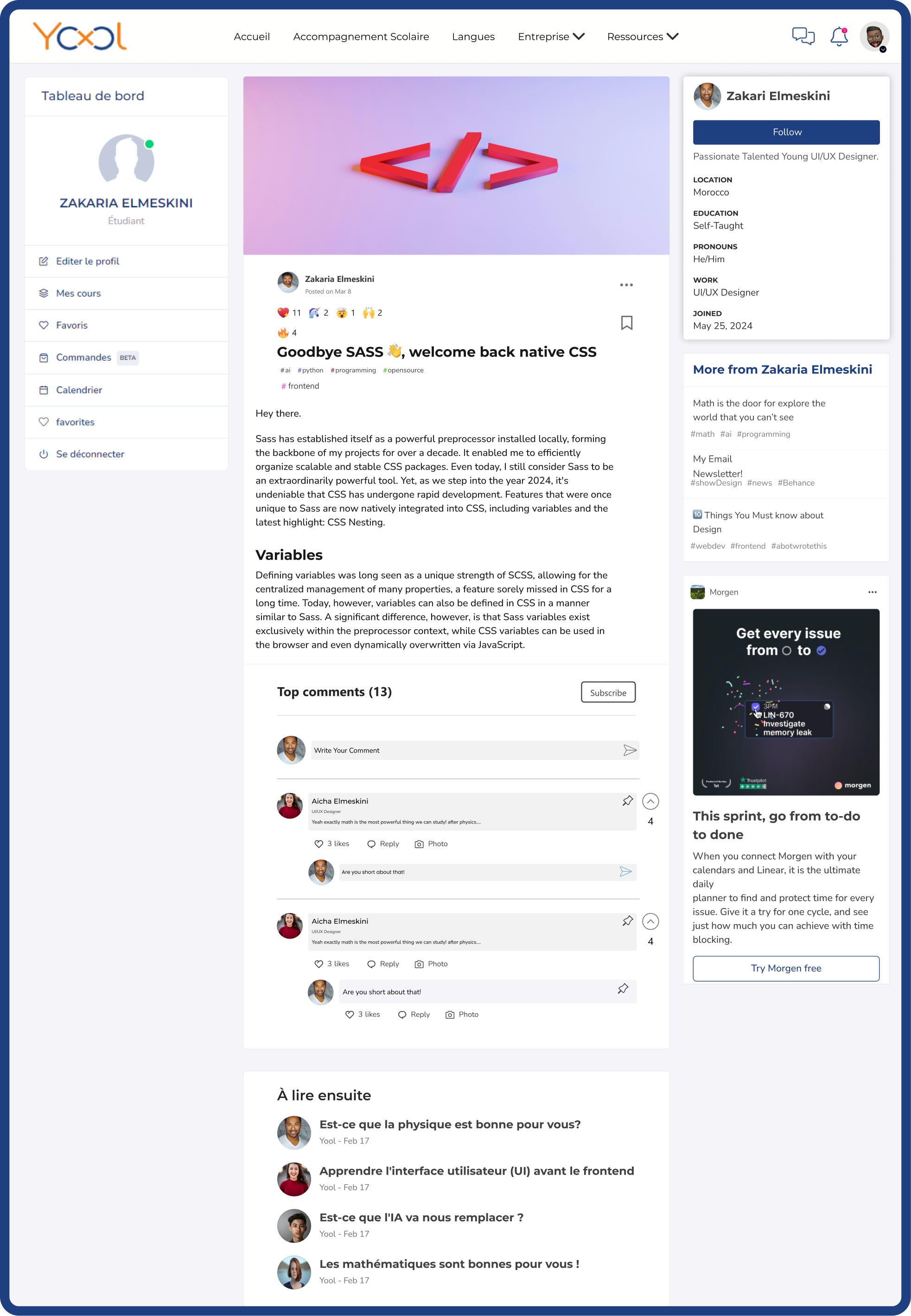
Community as a Supporting Layer
Reinforcing motivation, trust, and progression
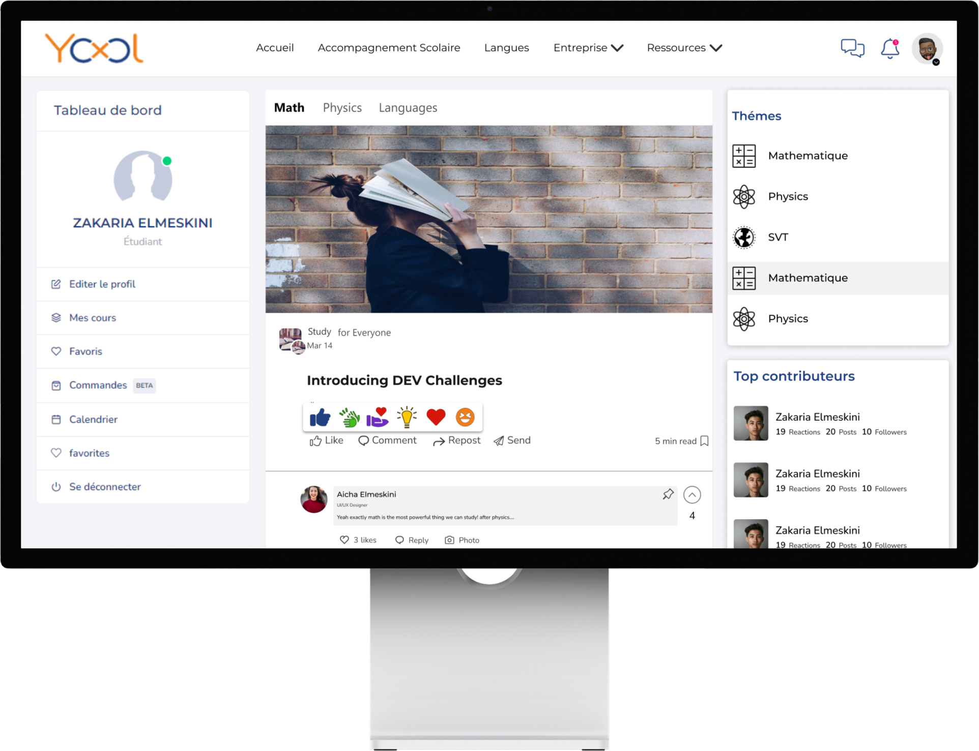
Community features support learning without competing with it. Active discussions are paired with top contributors, and recognition badges appear in context without pulling focus. Moments like top courses and the real app audit extend engagement beyond single sessions, encouraging long-term investment with beauty serving users first and app second.
Identity & Trust
Profiles that reflect contribution, not promotion
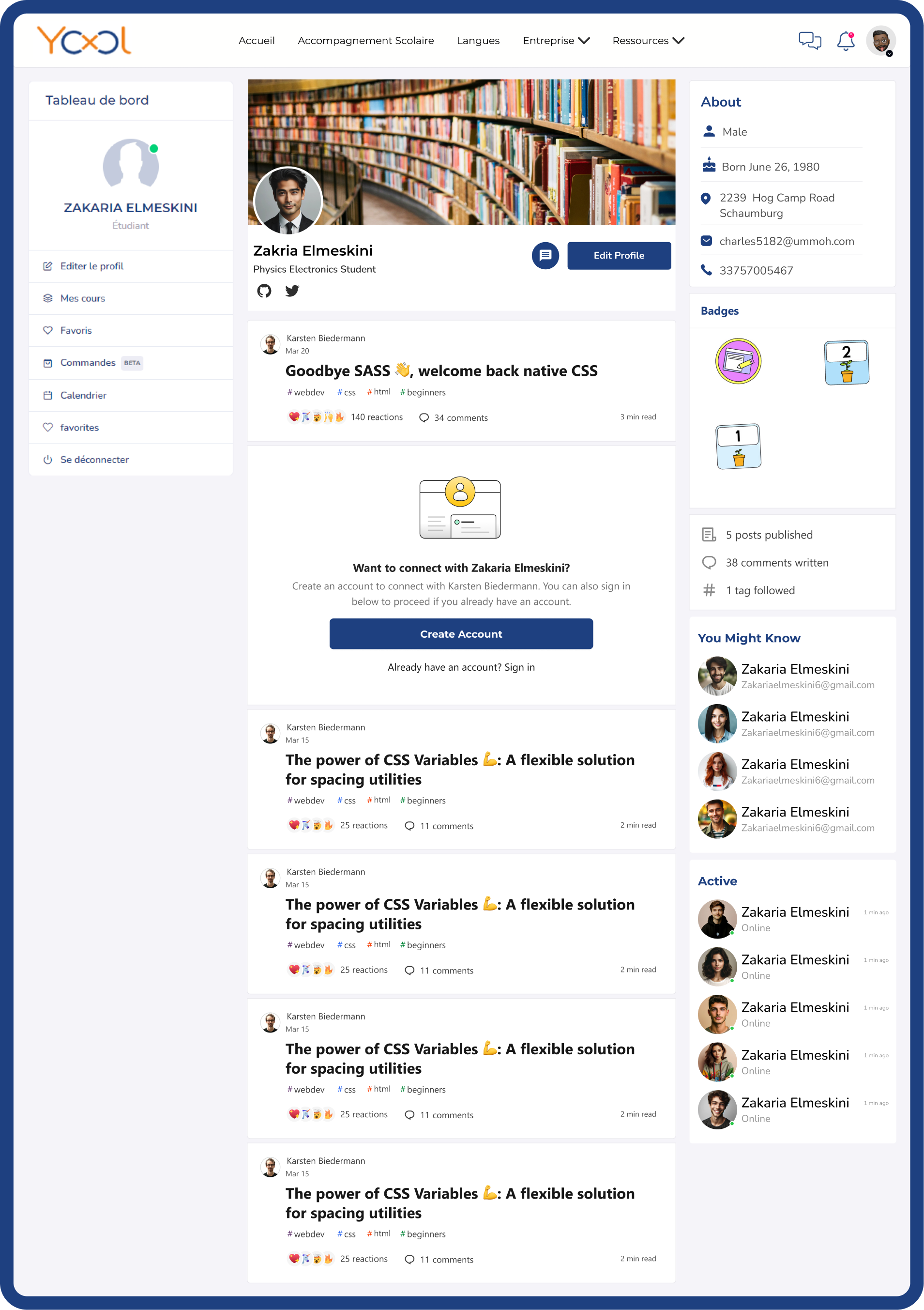
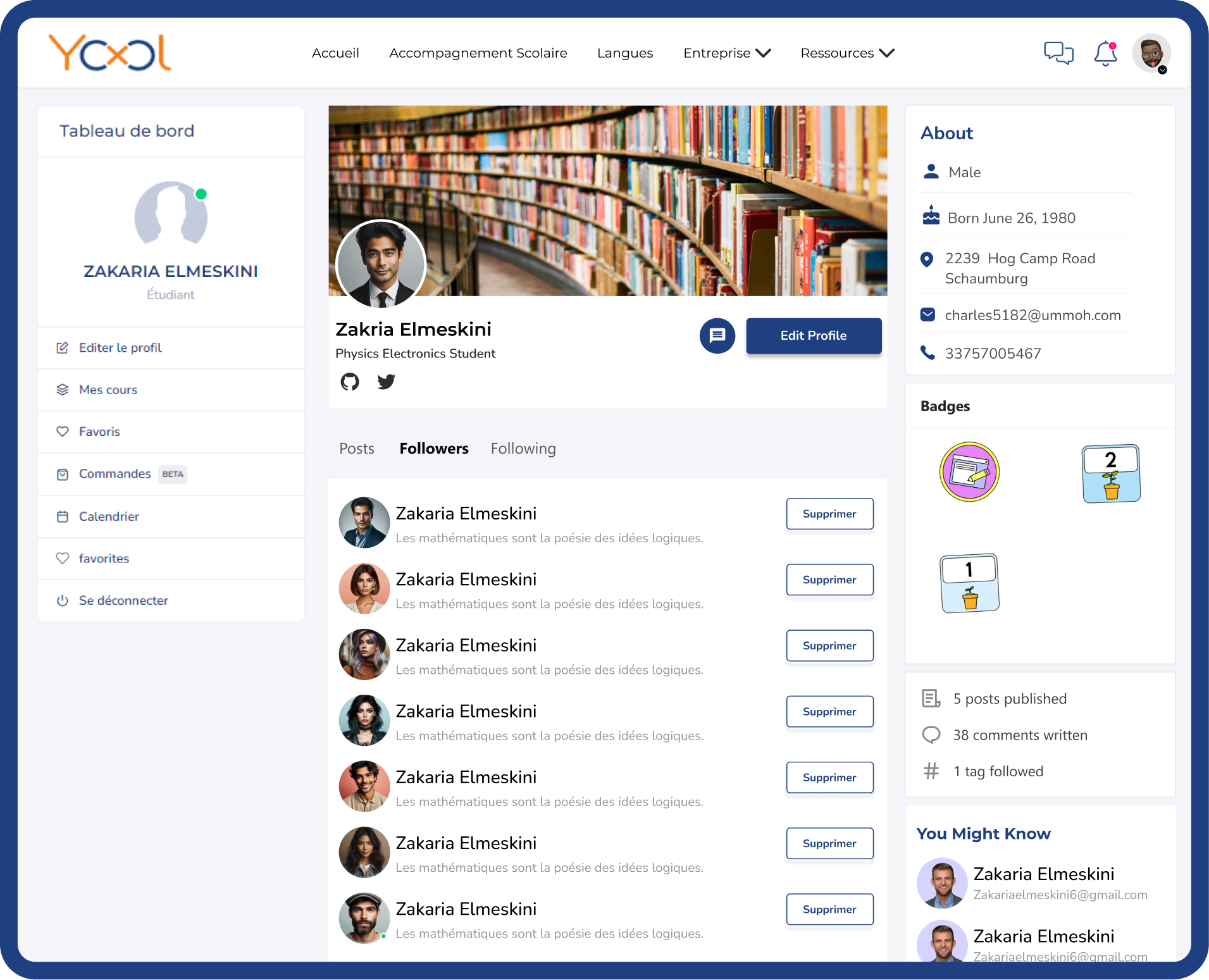
User profiles emphasize learning activity, participation, and follower connections, helping users understand who they are learning from and strengthening credibility across the platform.
CONTRIBUTING CONTENT
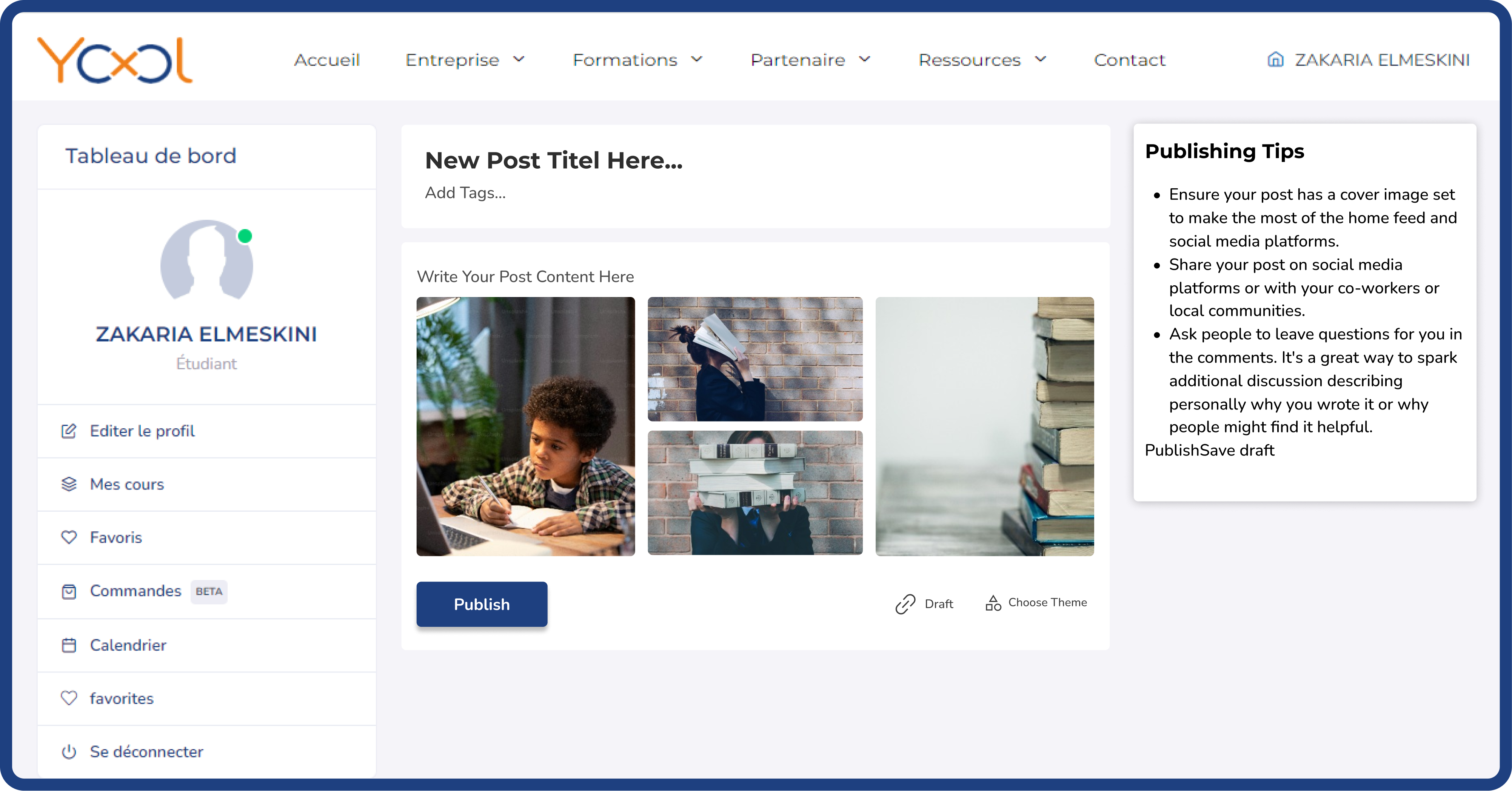
Content creation is intentionally lightweight. By reducing required fields and unnecessary steps, users are encouraged to share ideas, questions, and resources without hesitation.
STAYING INFORMED
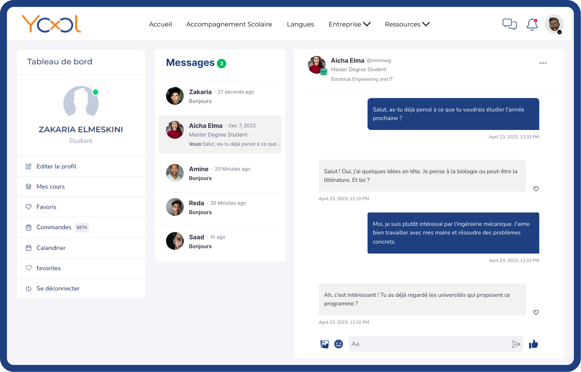
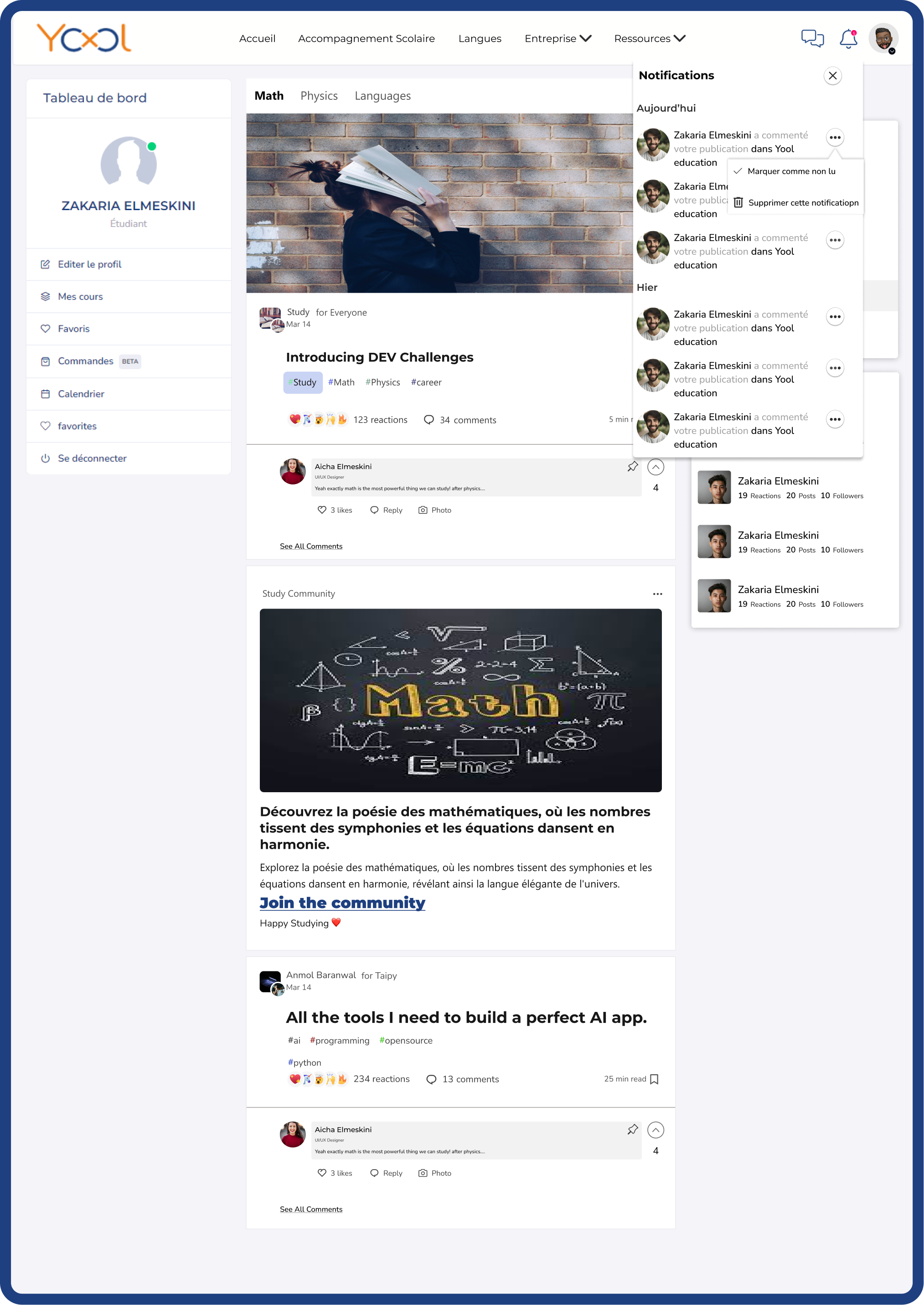
Notifications focus on meaningful activity—comments, follows, and contributions—so users stay informed without feeling overwhelmed. Relevance is supported at every step.
Outcome & Reflection
The final design delivers clearer recognition, easier discovery, and more confident engagement, because it led to simpler inputs and interactions.
This project reinforced that effective learning platforms guide decisions instead of exposing everything at once. Features are only useful if they don't get in the way—the less users have to think about navigation, the more mental space they have to actually learn.