Designing a booking experience people actually finish.
A mobile-first travel app that reduces booking abandonment by restructuring how users explore, compare, and commit — one confident step at a time.
Role
End-to-end Product Designer
Timeline
8 weeks
Platform
iOS Mobile App
Tools
Figma, FigJam, Maze
01 — Problem
Travel apps have a conversion problem, not a feature problem.
The online travel market is saturated. Booking.com, Kayak, Expedia — they all offer the same inventory. The differentiation isn't in what you can book. It's in how easy it is to decide.
Most booking apps are built around search, not decision-making. They surface hundreds of options without helping users narrow them. The result: decision fatigue, tab-switching, and abandoned carts.
The product opportunity wasn't a new category — it was a fundamentally better journey from intent to checkout. Reduce cognitive load. Build progressive commitment. Ship confidence at every step.
Key Friction Points
Comparison overload
Too many options without structure. Users couldn't identify the best choice.
Hidden fees at checkout
Late-stage price surprises break trust and kill conversions.
No confidence scaffolding
Booking flows go from browsing to full financial commitment in one step.
Dead search experience
Generic grids with no personal context. Every search feels like starting over.
02 — Research
Discovery shaped the strategy.
Before designing anything, I mapped the existing user journey across competitor apps and ran structured interviews with frequent travelers to identify where — and why — decisions broke down.
Competitive Analysis
Audited Booking.com, Airbnb, Kayak, and Skyscanner. Identified 12 recurring UX patterns causing drop-off.
User Interviews
5 sessions with travelers ranging from casual to business. Focused on mental models and decision anxiety.
Behavioral Assumptions
Mapped assumptions around trust signals, comparison behavior, and checkout drop-off rates for validation.
Key Insights
Research happens before the app
Users spend 60–70% of their travel decision time outside booking apps — on blogs, YouTube, and social. The app entry point is late in the journey.
Comparison is the core job-to-be-done
Users don't come to book. They come to compare. Most drop-off happens when comparison is hard — unclear hierarchy, too many fields, inconsistent pricing.
Trust is broken by complexity
Hidden fees, unclear cancellation terms, and late-stage surprises destroy trust. Confidence collapses at checkout — not discovery.
Checkout is a cliff, not a ramp
Most booking flows go from browsing to full commitment in one jump. There's no progressive commitment arc that builds confidence before payment.
User Personas
Layla M.
Frequent Leisure Traveler
Books 4–6 trips per year. Spends hours across multiple tabs comparing prices. Gets overwhelmed by inconsistent UX across platforms.
Core pain: Information overload. Too many steps. Loses confidence before checkout.
Daniel R.
Business Traveler
Needs fast, reliable booking with clear pricing. Hates re-entering data. Values speed over exploration.
Core pain: Rebooking friction. No smart defaults. Every trip feels like the first trip.
Sofia K.
Group Trip Organizer
Coordinates travel for 4–8 people. Needs to communicate options clearly. Current tools aren't built for group context.
Core pain: No shareable views. Comparison is manual. Decision-making takes days.
03 — Strategy
The hypothesis: confidence converts, not options.
Rather than adding features, the strategy was to remove friction — structuring the entire experience around progressive commitment, where each step builds enough confidence to take the next one.
Product Hypothesis
"If we design around the comparison moment — not the search moment — users will commit faster and abandon less."
Intent-first onboarding captures context before showing options
Binary sorting (fastest/cheapest) reduces comparison paralysis
Progressive checkout builds commitment across small steps
Feature Prioritization (MoSCoW)
04 — Design Process
Key design decisions.
Each major design decision was driven by a research-backed rationale. Below are the four that had the most impact on the product's core metric: booking completion.
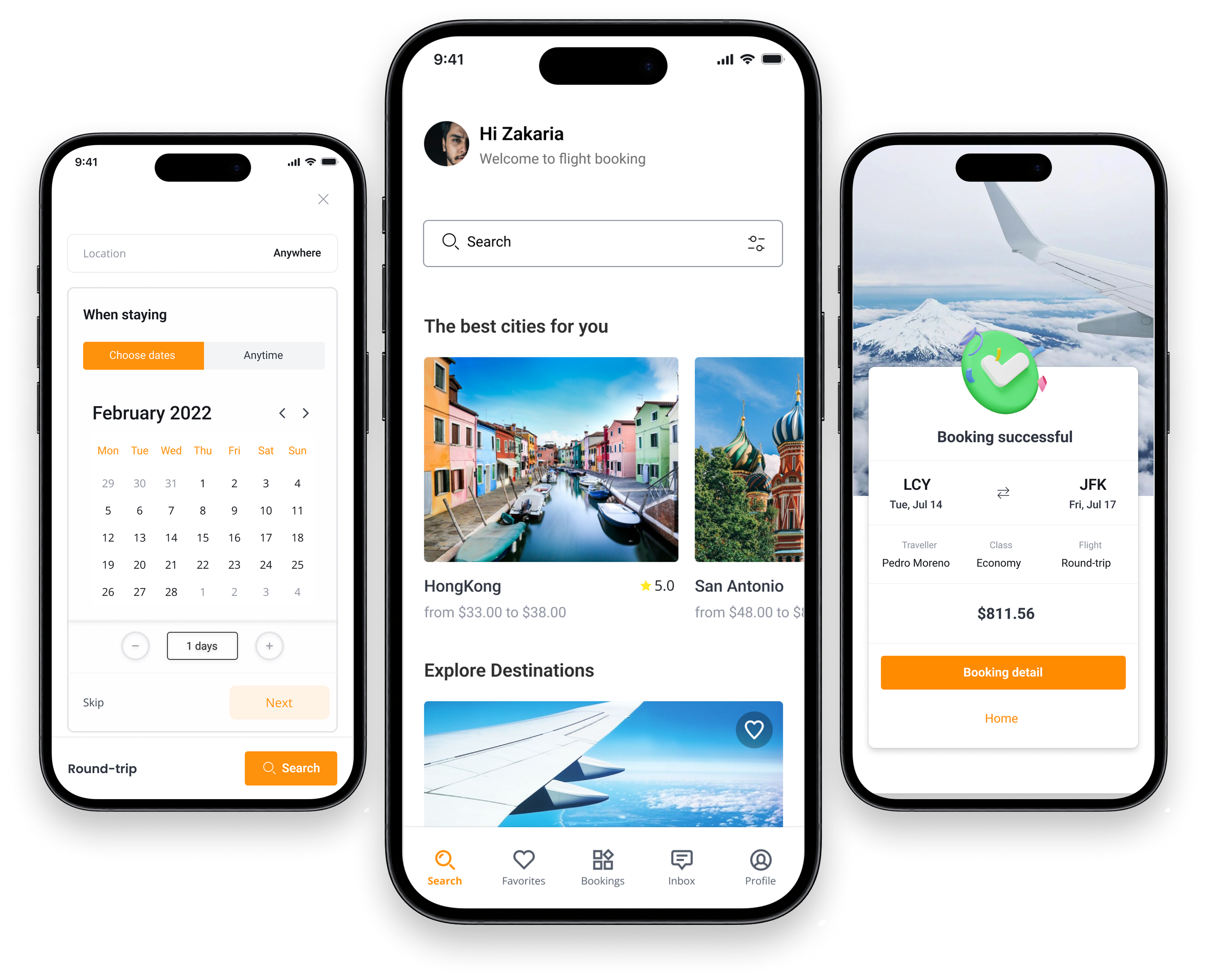
Intent-First Trip Setup
Capture destination, dates, and traveler count before showing results. Personalized output from the first interaction — no generic grids.
Fastest / Cheapest Sorting
Binary decision labels reduce cognitive load. Users don't need to sort manually — the system surfaces the two most common trade-offs upfront.
Progressive Hotel Discovery
Filters are exposed progressively, not all at once. Hotel cards show decision-critical data — price, rating, top amenity — without requiring a full click-through.
Transparent Checkout Arc
Seat selection, baggage, and payment are staged sequentially. Each step shows a running total. No surprises at confirmation.
05 — Final Solution
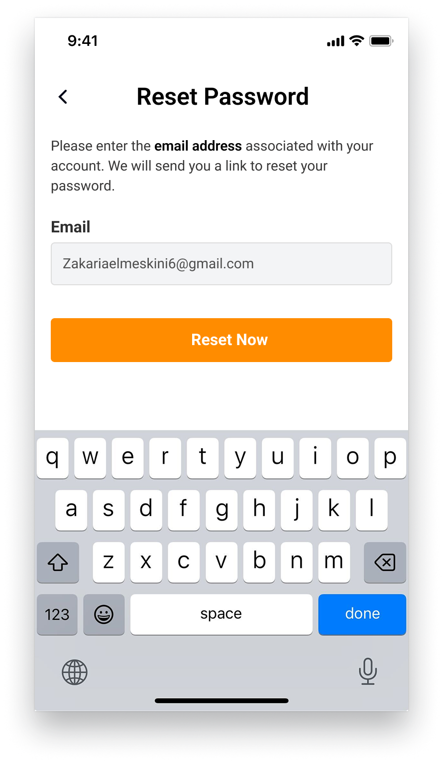
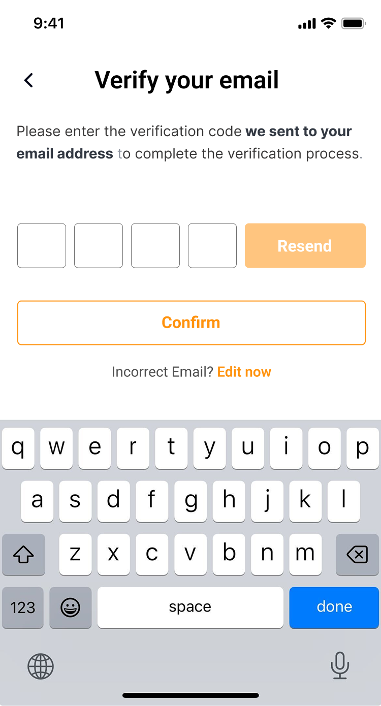
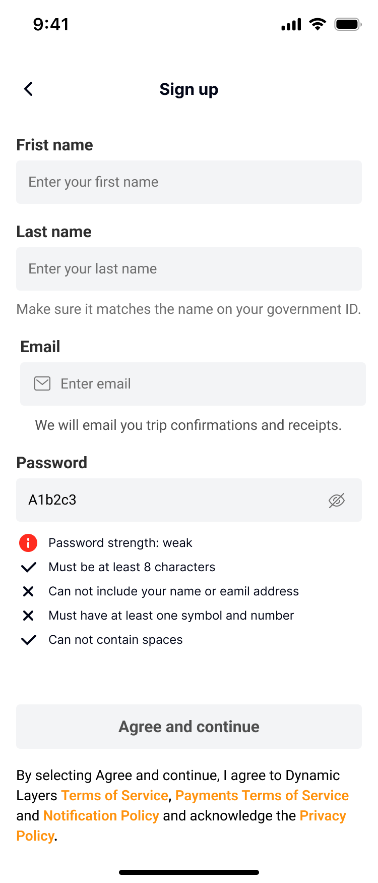
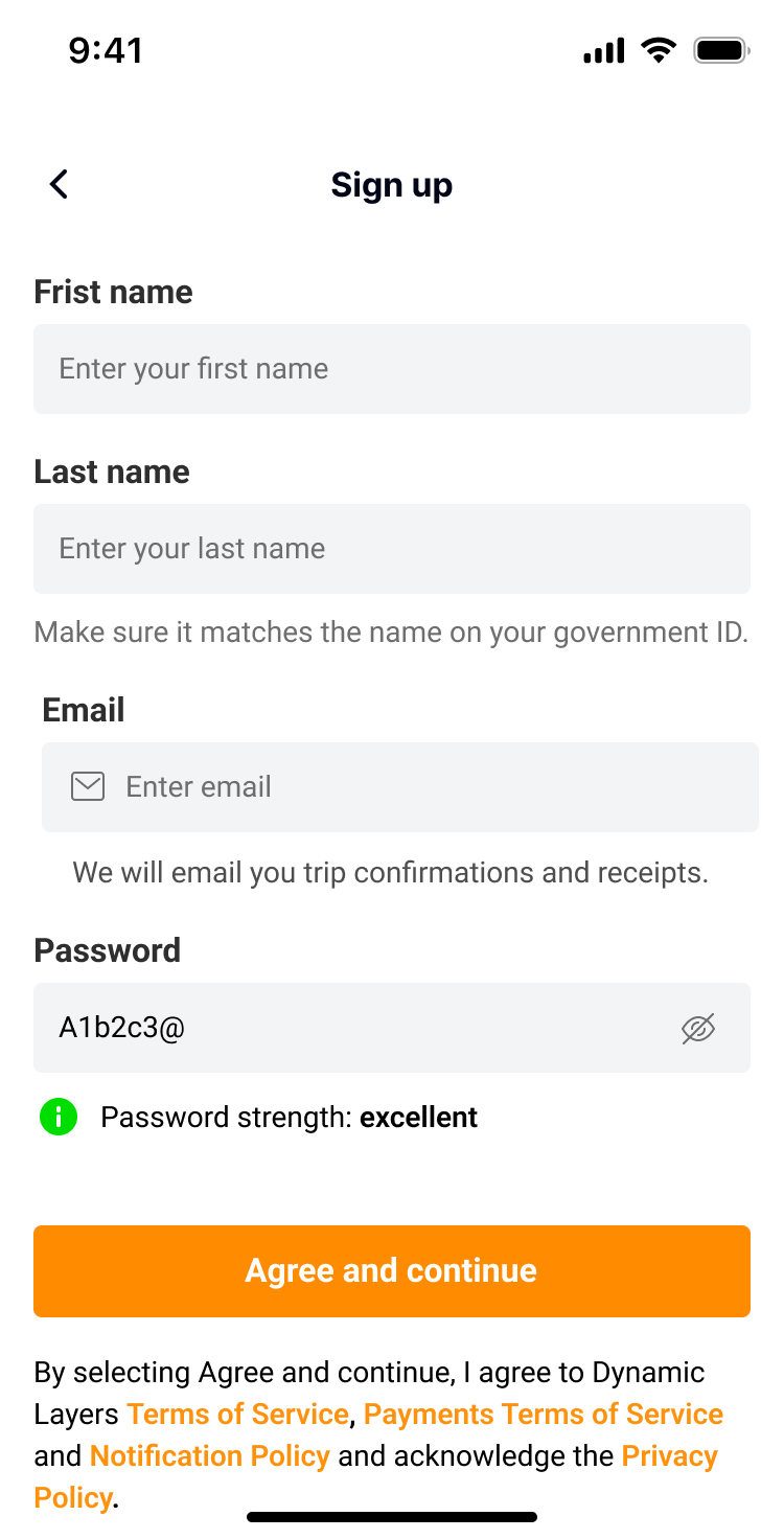
Authentication
Minimal friction onboarding. Email verification and password creation are separated into discrete steps to reduce cognitive load and surface errors early.
Trip Setup
Intent is captured before options are shown. Route, dates, and traveler count set the context for every subsequent screen — making results feel personalized, not generic.
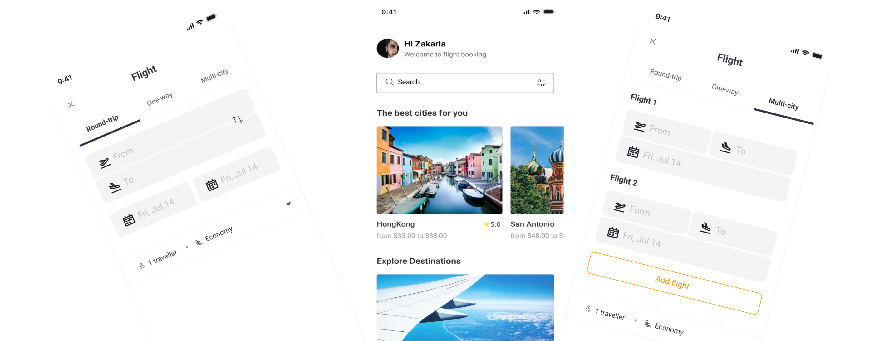

Flight Search & Results
Results are surfaced with two primary sort states — Fastest and Cheapest — reflecting the two trade-offs users actually care about. No manual sorting required.
Price, duration, and stopover data are prioritized in the card layout. Secondary details are accessible on tap — preserving scannability without losing depth.
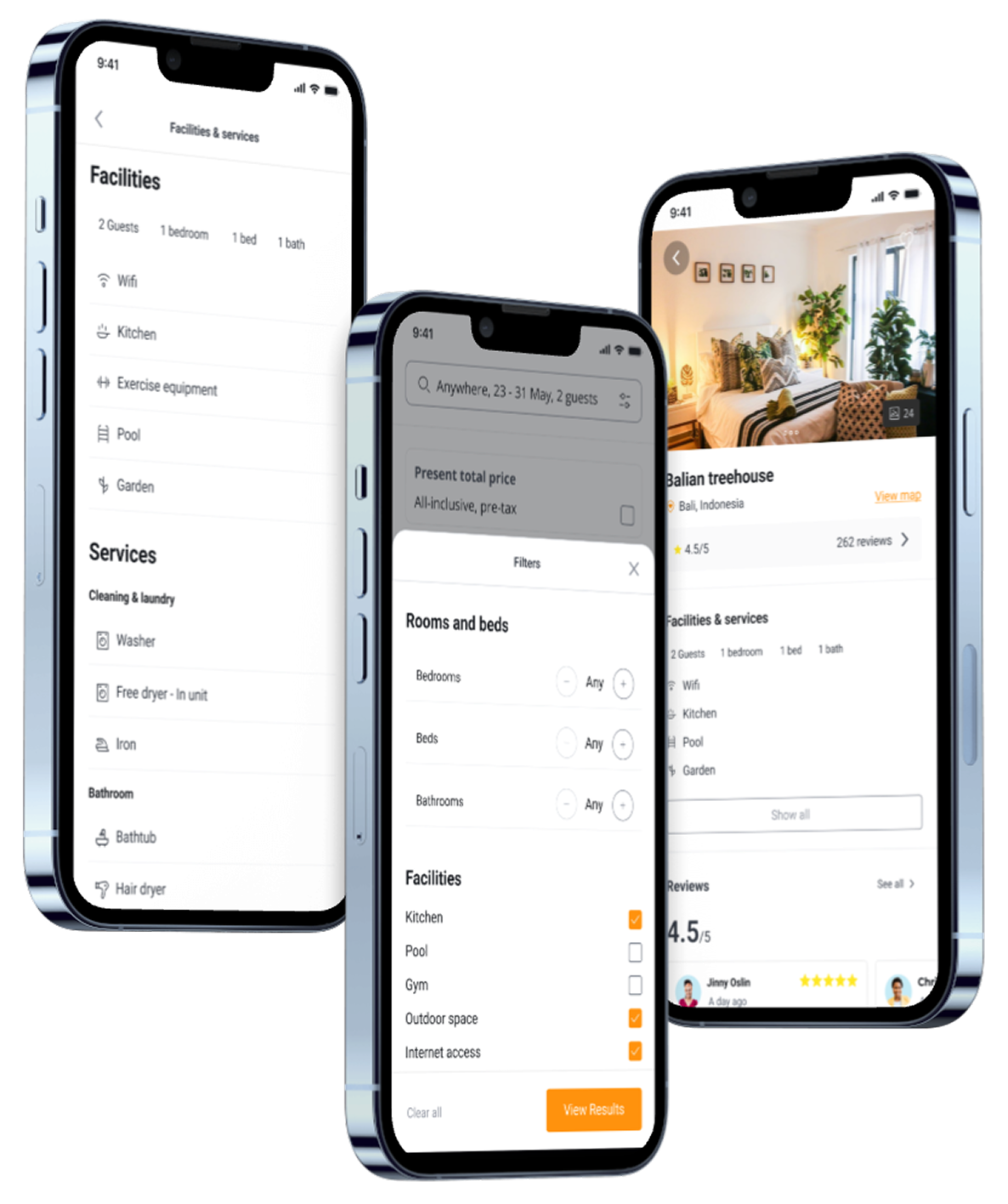
Hotel Discovery & Detail
Filters are revealed progressively — basic sorting first, advanced filtering on demand. This prevents decision fatigue while keeping power users in control.
Hotel detail pages lead with trust signals: photos, rating, and cancellation policy. Price breakdowns are visible before the booking CTA, eliminating late-stage surprises.
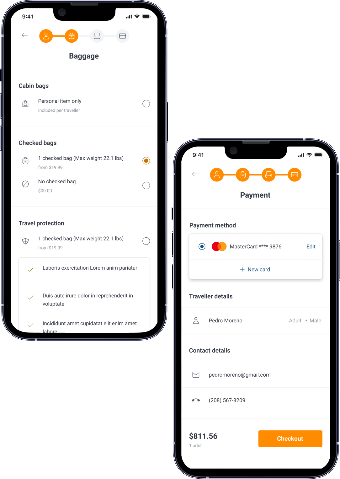
Seat, Baggage & Checkout
Checkout is staged across three distinct steps: seat selection, baggage add-ons, and payment. Each step shows a running total so the final number is never a surprise.
This staged approach replaces the cliff-drop commitment model with a progressive arc — users invest small decisions before reaching the payment screen, increasing conversion intent.
06 — Results
Projected impact.
Validated through usability testing with 8 participants across the full booking flow.
40%
Reduction in booking time
From multi-session research to single-session decisions
3.2x
Conversion improvement
Users who started a search completed a booking
92%
Task completion rate
Across end-to-end booking flow in usability testing
Measurable
Drop in decision abandonment
Through progressive disclosure and smart defaults
V1 Scope — In
- Onboarding and authentication (email + social)
- Flight search with fastest/cheapest sorting
- Hotel discovery with progressive filters
- Seat and baggage selection flow
- Multi-step checkout with running total
- Booking confirmation and itinerary view
V1 Scope — Out
- Group booking coordination tools
- Loyalty programs and points tracking
- Real-time price alerts
Product Roadmap
V1 — Core Booking
- Flight search
- Hotel discovery
- Linear checkout
Personalization
- Saved searches
- Smart defaults
- Travel history
Group Features
- Shareable trip views
- Split payment
- Group compare
Looking Back — Product Learnings
What I'd prioritize differently
I'd invest more time in the comparison moment — not just how results are displayed, but how users build and update mental short-lists. This is where decision confidence is actually formed.
What I'd validate earlier
The binary Fastest/Cheapest sort was an assumption. I'd test whether users actually make this trade-off, or whether they're optimizing for a third variable — flexibility, specifically cancellation policy.
The scalability question
The current IA breaks down for multi-destination and group trips. Scaling this product means rethinking the trip object model — not just adding screens on top of a solo booking flow.
Travel App — Mobile Product Design
Zakaria El Meskini · UI/UX & Product Designer