ALTER LEARNING
Designing a Scalable Platform for Immersive Education
Introduction
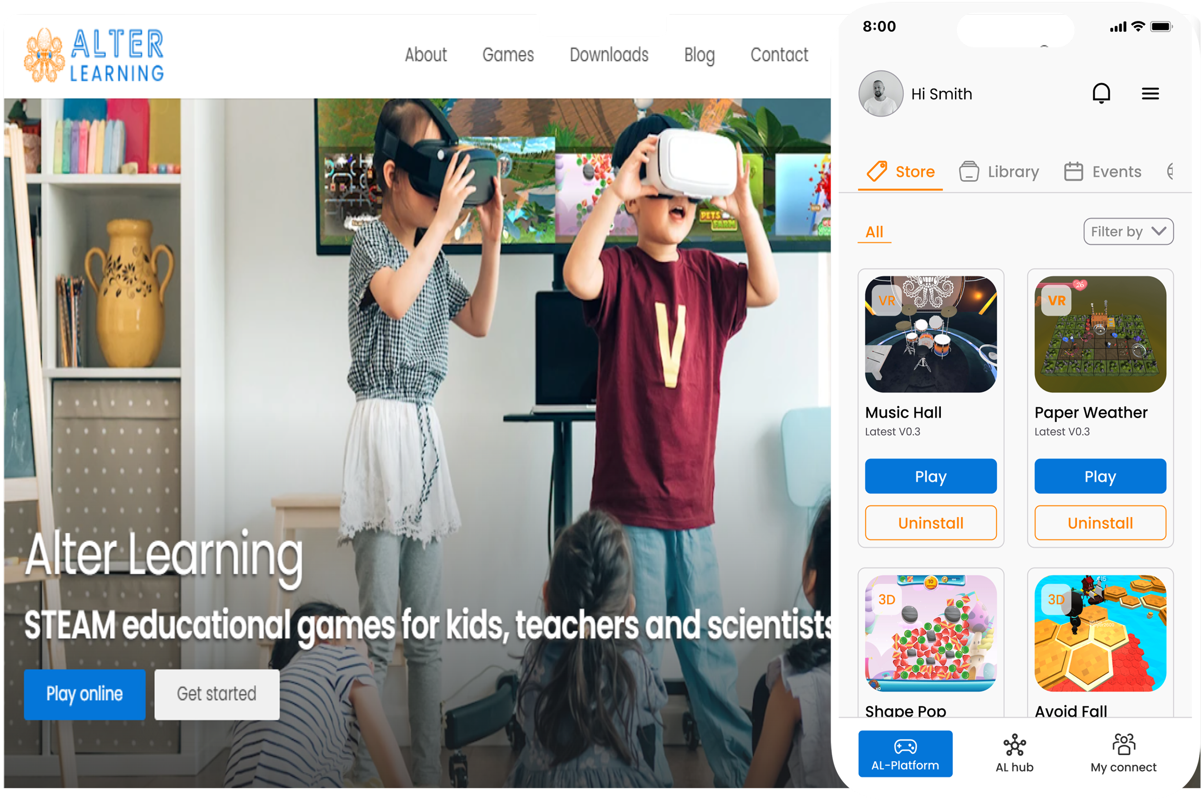
Alter Learning delivers immersive educational experiences across web and VR environments. My role focused on simplifying complex workflows, creating consistent systems, and enabling the platform to scale across content types, roles, and devices.
The Situation
As Alter Learning scaled to fit content, events, and user tiers, the platform became increasingly difficult to navigate and manage across experiences.
The Challenge
As complexity grew, fragmented navigation, inconsistent patterns, limited system visibility, and poor responsiveness reduced clarity and operational efficiency.
Approach
Instead of redesigning individual screens, I focused on platform-wide decisions—information architecture, layout patterns, and system consistency—to ensure the experience could scale over time.
Platform Entry & Content Discovery
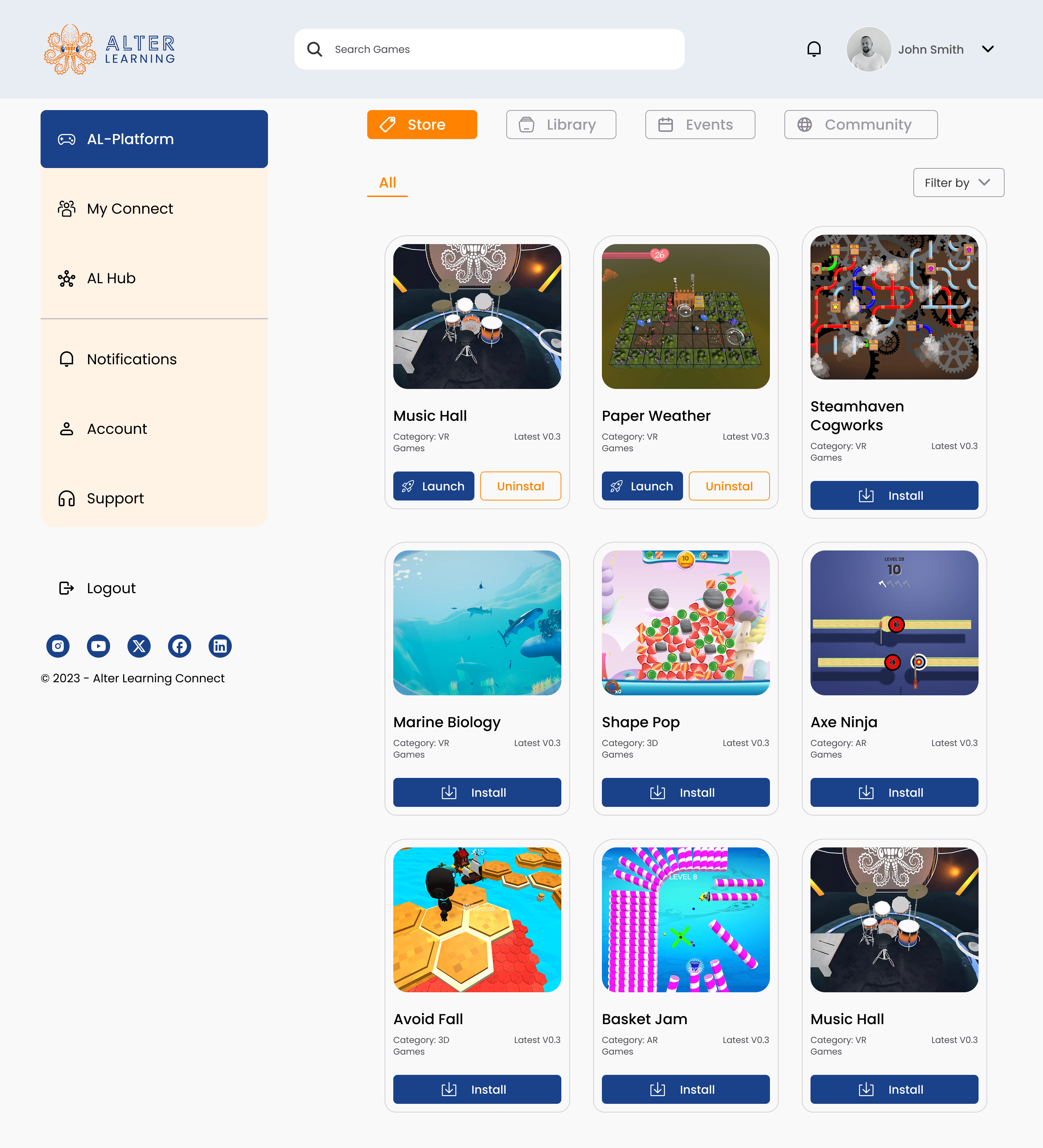
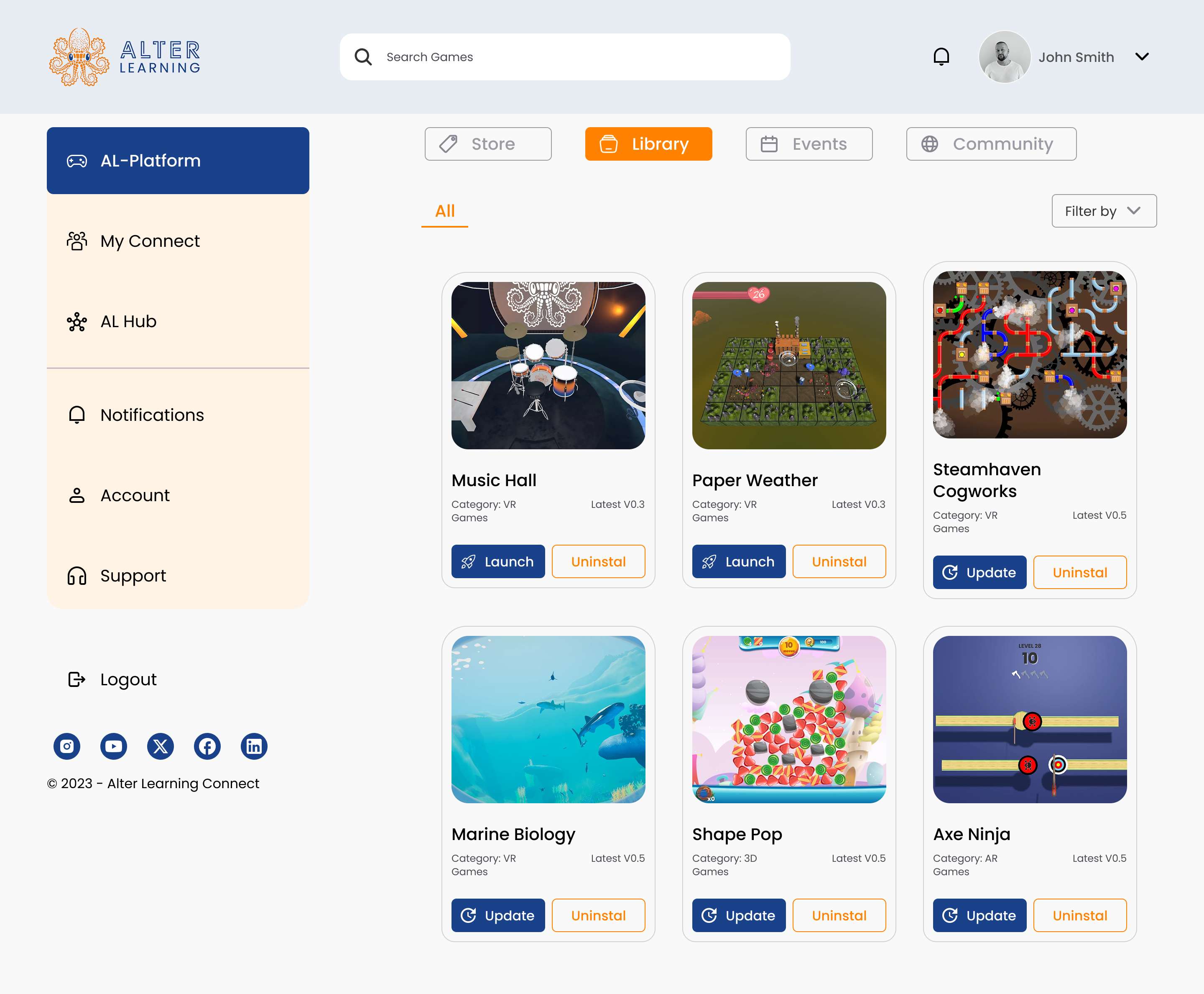
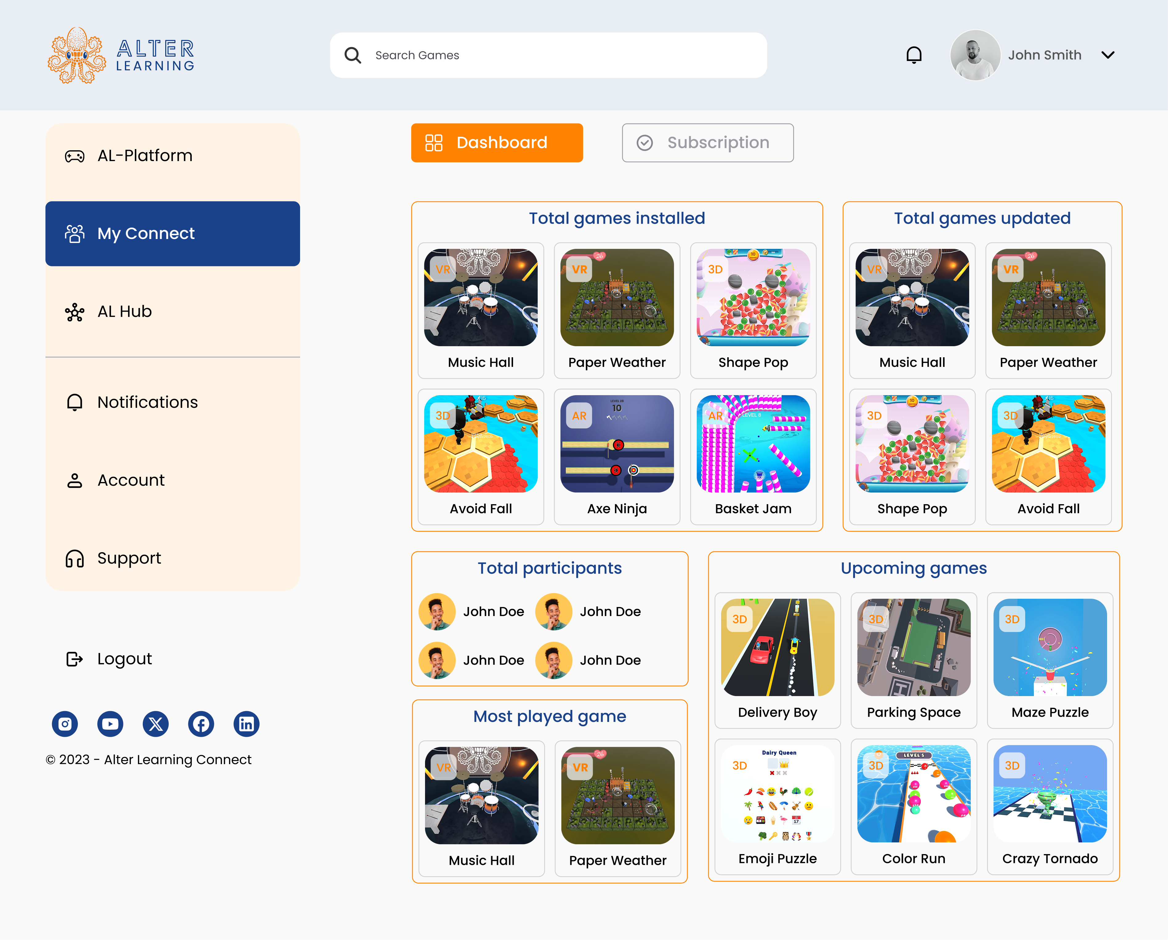
Entry points are structured to match distinct user intents—exploring new experiences, accessing owned content, and discovering time-based learning. Store, Library, and Events reduce cognitive load by separating tasks, while dedicated event views help users quickly distinguish what's new from what's currently active or upcoming.
Community as a Supporting Layer
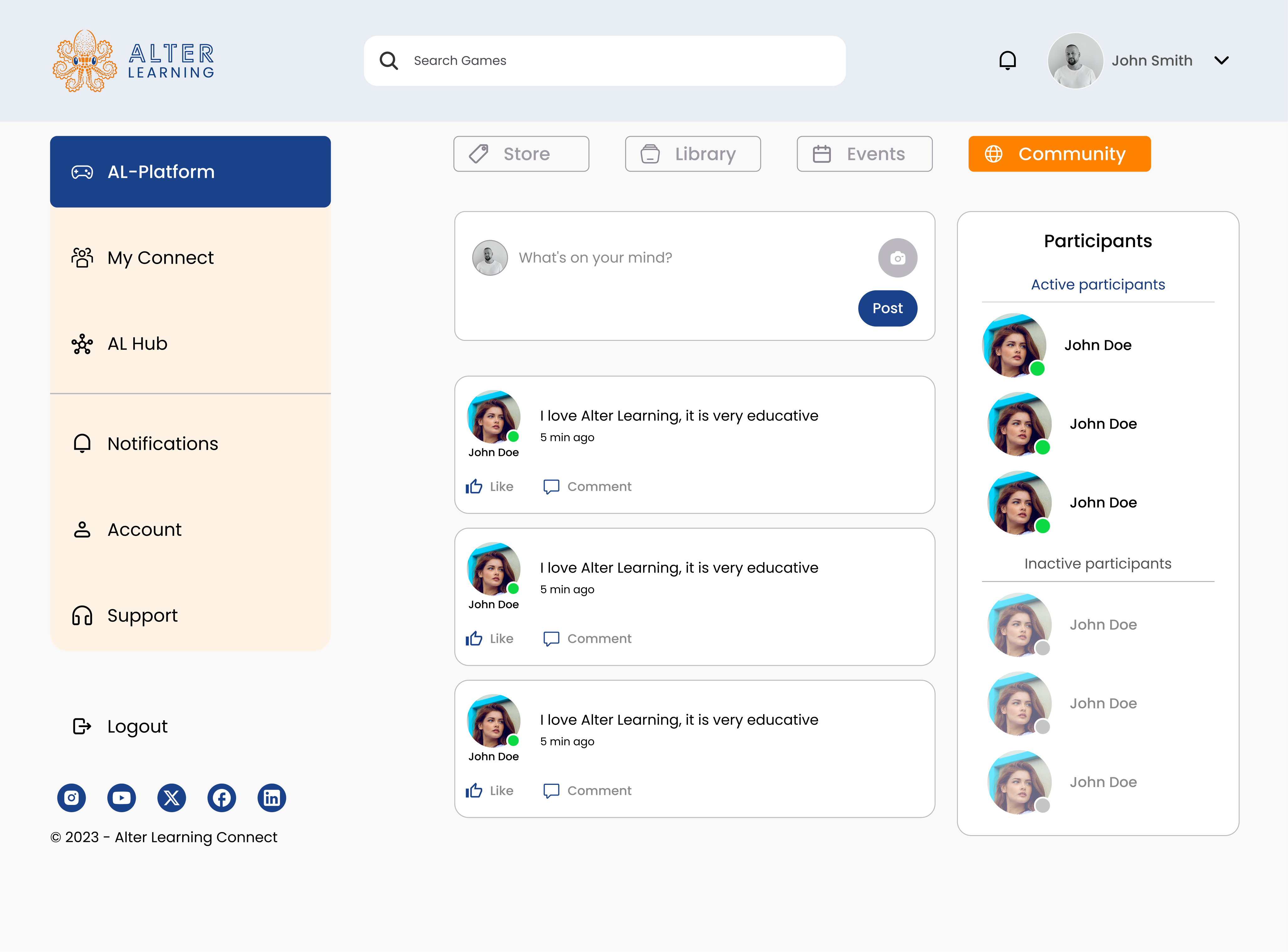
Community features reinforce motivation and trust without competing with learning goals. Active discussions, top contributors, and badges surface credibility while keeping the learning experience central.
Account & Access Management
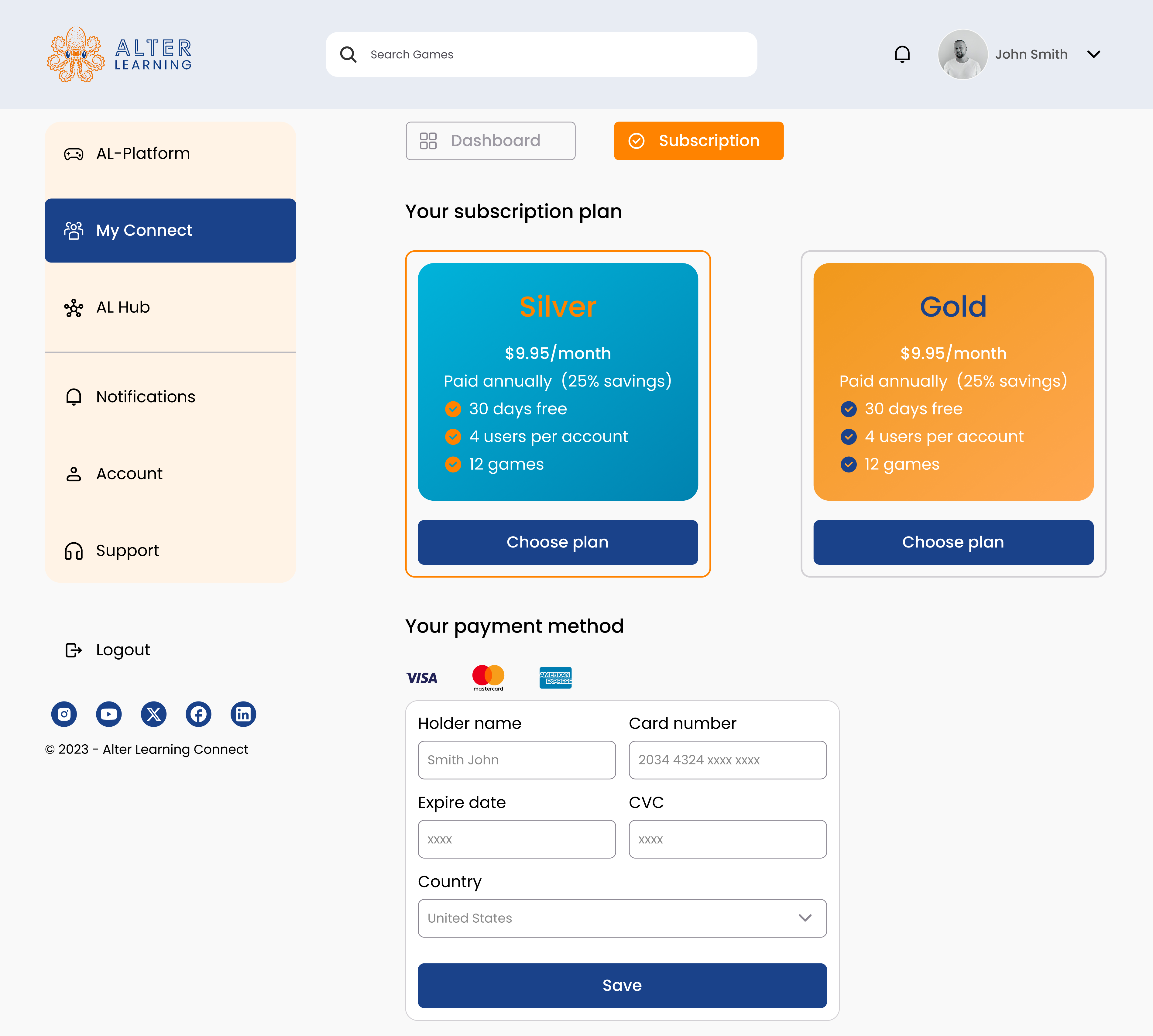
Account and subscription views are separated from content discovery to provide clarity around access, permissions, and plans, reducing confusion and support dependency during critical account moments.
Support & Edge Cases
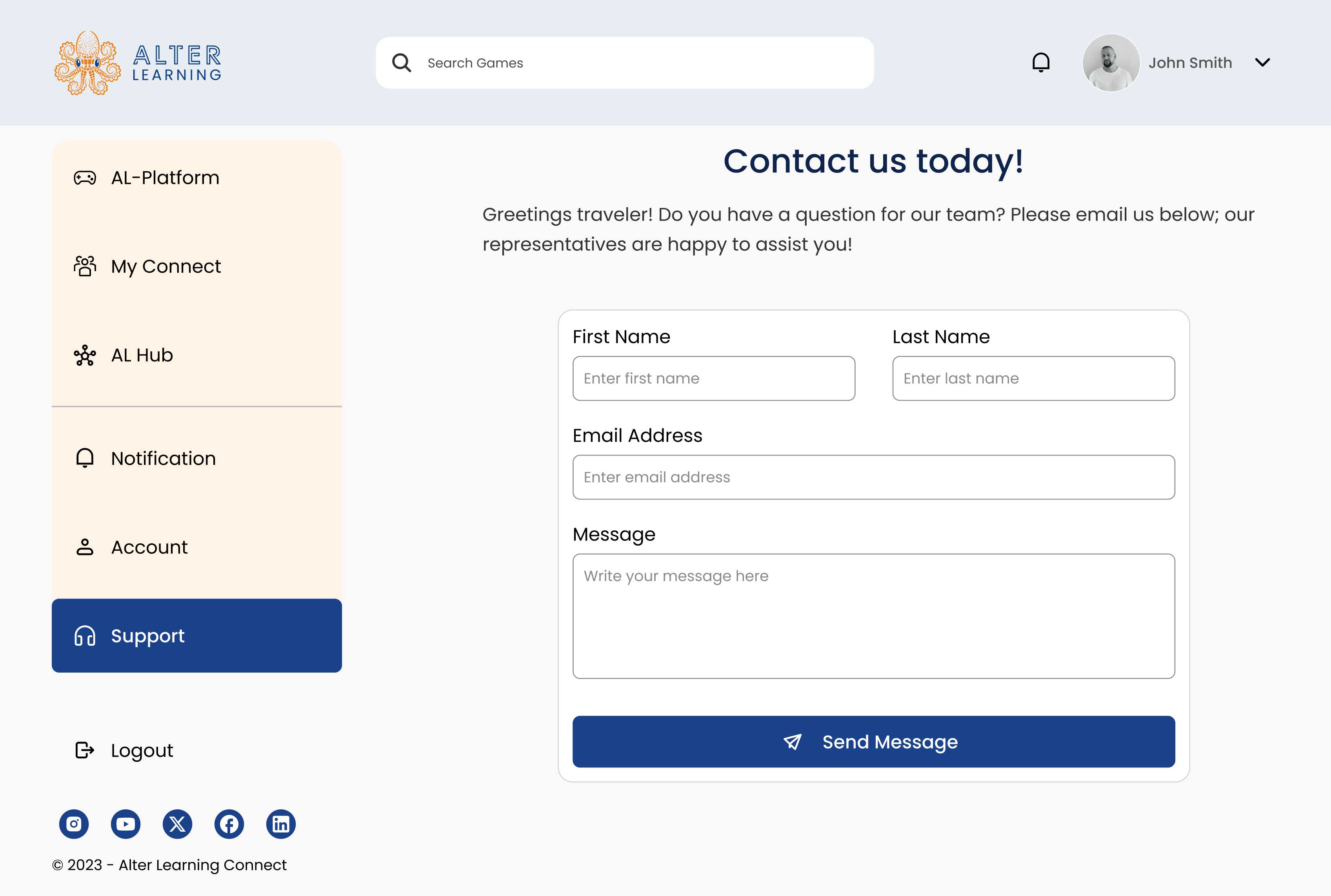
Support and confirmation flows are designed as trust-preserving moments, preventing accidental actions and guiding users clearly when something goes wrong.
Mobile & Responsive Experience
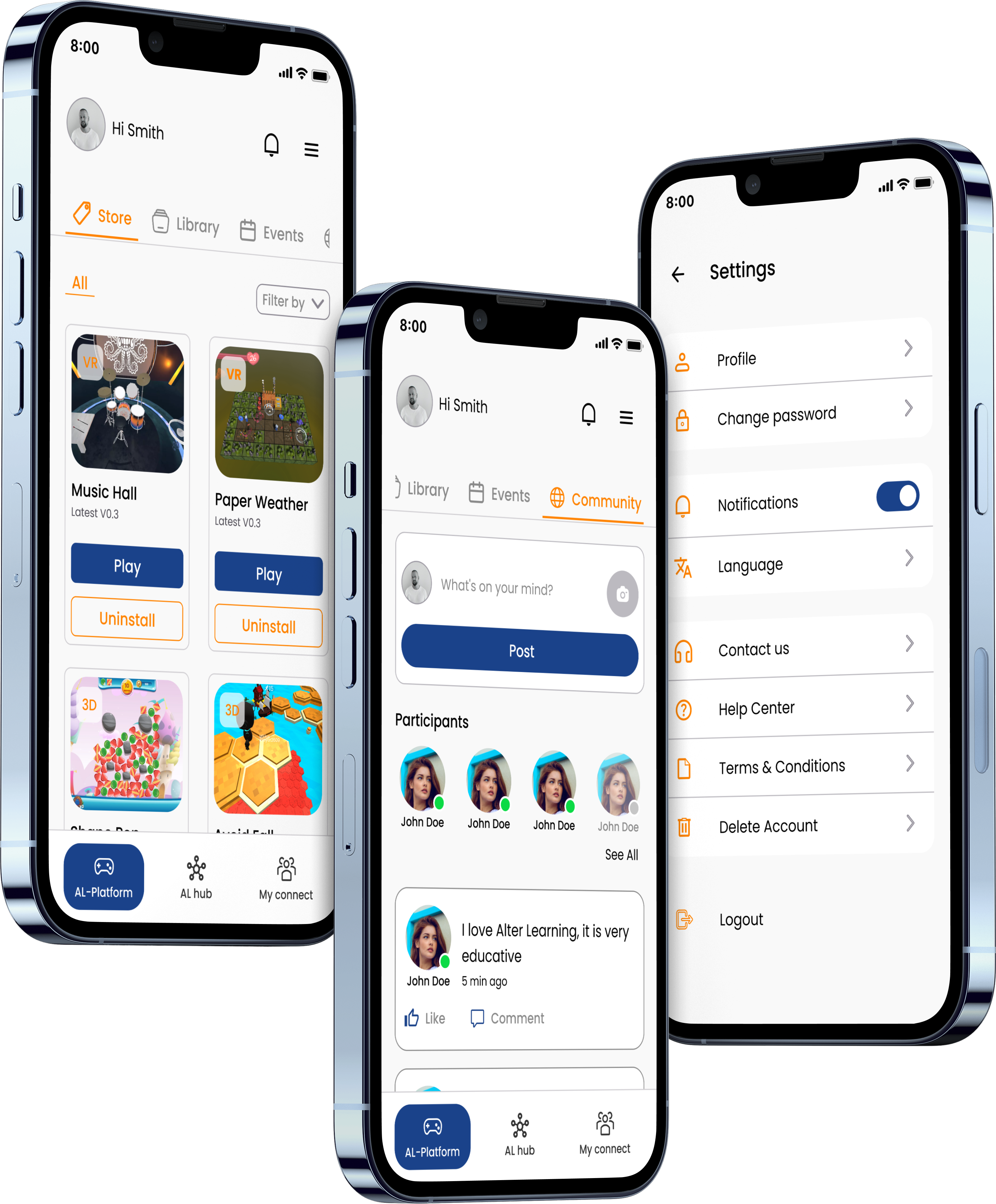
The mobile experience prioritizes core tasks—continuing experiences, browsing content, and checking access— while maintaining hierarchy and clarity across smaller screens.
Outcome & Reflection
The final design reduces complexity through clearer structure, consistent patterns, and stronger system feedback. Most impactful UX improvements come from information architecture, continuity through the hub, and thoughtful handling of edge cases.